Download the PHP package tonegabes/filament-better-options without Composer
On this page you can find all versions of the php package tonegabes/filament-better-options. It is possible to download/install these versions without Composer. Possible dependencies are resolved automatically.
FAQ
Example:

In general, it is recommended to use always a project to download your libraries. In an application normally there is more than one library needed.

- Some hosting areas are not accessible by a terminal or SSH. Then it is not possible to use Composer.
- To use Composer is sometimes complicated. Especially for beginners.
- Composer needs much resources. Sometimes they are not available on a simple webspace.
- If you are using private repositories you don't need to share your credentials. You can set up everything on our site and then you provide a simple download link to your team member.
- Simplify your Composer build process. Use our own command line tool to download the vendor folder as binary. This makes your build process faster and you don't need to expose your credentials for private repositories.
Informations about the package filament-better-options
Filament Better Options


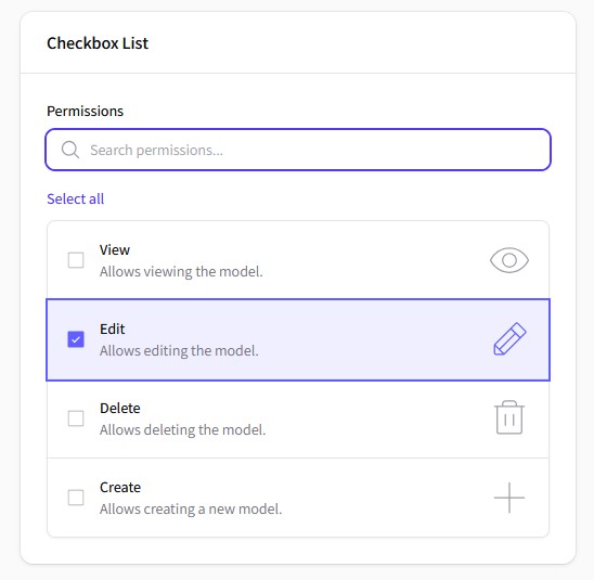
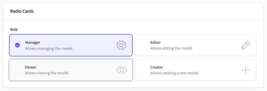
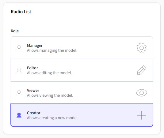
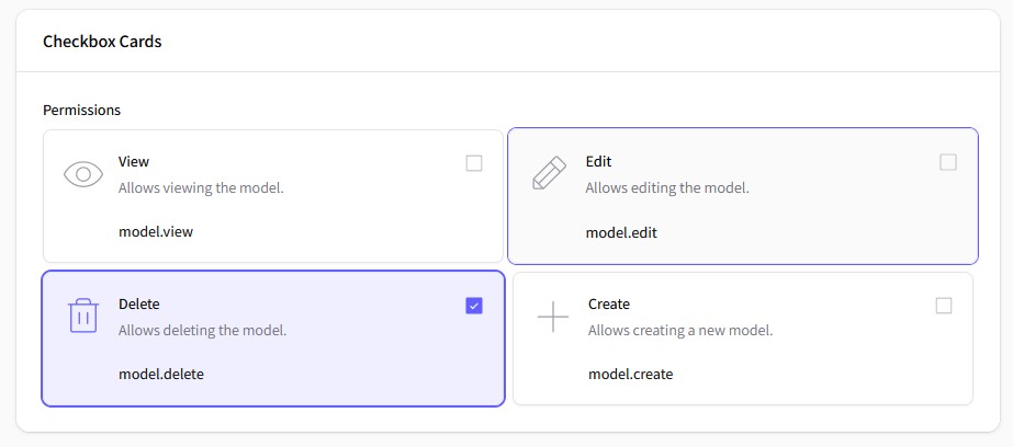
Enhanced form components for Filament Forms with modern interface, advanced features, and excellent performance. Provides CheckboxList, CheckboxCards, RadioList and RadioCards with icons, visual indicators, descriptions, extra texts, per-option colors, search functionality, and bulk operations.
Available components
| Family | List | Cards |
|---|---|---|
| Checkbox | CheckboxList |
CheckboxCards |
| Radio | RadioList |
RadioCards |
Features
✨ Enhanced UI Components
- Modern card-based and list layouts
- Extensible icon system using Filament icons aliases
- Flexible icon positioning (before/after)
- Support for descriptions and extra texts
- Pre-defined themes (minimal, modern, classic)
Advanced Features
- Real-time search with debounced input
- Bulk select/deselect operations for checkboxes
- Configurable positioning and visibility
- Performance-optimized JavaScript
🎨 Extensible Architecture
- Tailwind CSS styling with dark mode support
- Configurable default positions and icons via config file
- Full accessibility support
Performance & Caching
- Intelligent icon caching system
- Efficient DOM operations and caching
- Alpine.js components loaded on demand
- Minimal JavaScript footprint
Requirements
- PHP 8.2+
- Laravel 11.28+
- Filament 5.0+
- Livewire 4.0+
- Tailwind CSS 4.0+
Optional
tonegabes/filament-phosphor-icons^1.3 — when installed, Phosphor icons are used as defaults for indicators. Without it the package falls back to Heroicons aliases. You can always override defaults viaconfig('better-options.icons.defaults').
Installation
Install the package via Composer:
Optionally, publish the configuration file for positioning settings:
Optionally, publish the assets for customization:
Configuration
The published configuration file (config/better-options.php) provides customization positioning options:
Usage
Basic Examples
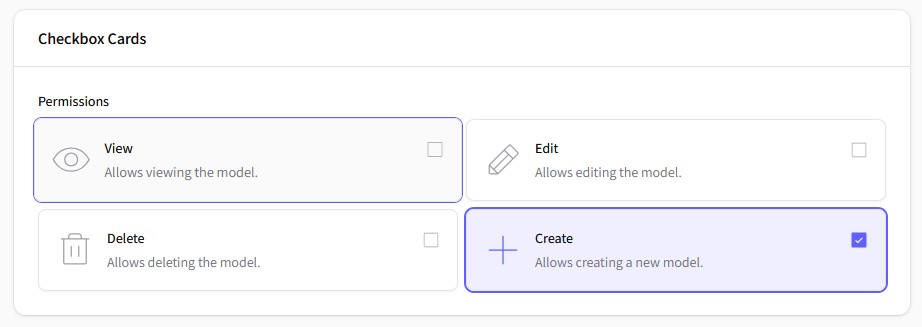
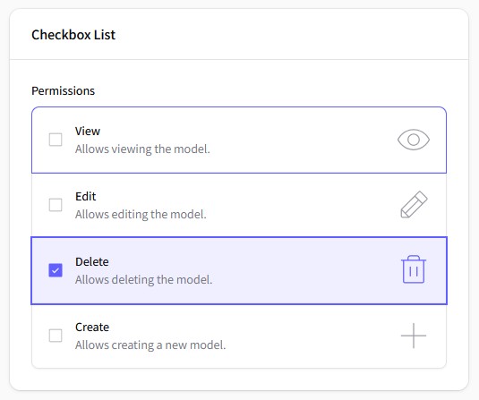
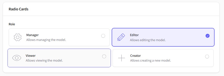
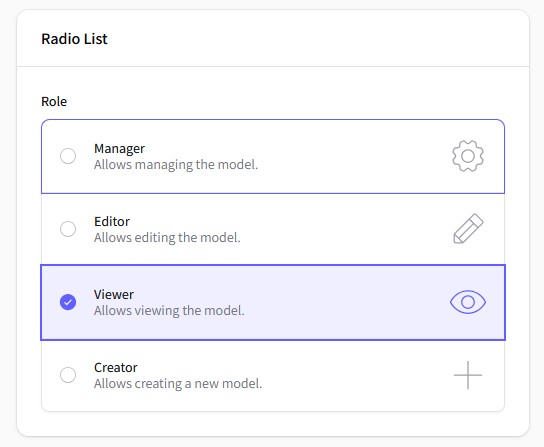
Using Enums
This package provides a convenient way to use PHP enums for defining options, descriptions, and icons. Here's how you can leverage enums in your component definitions:
Passing a Backend Enum automatically maps the enum cases to the component options, descriptions, icons, and extra texts.
You can hide the descriptions, icons, and extra texts if you don't need them.
Advanced Features
Search and Bulk Operations
Custom Positioning and Visibility
Icons and Indicators
Extra Texts/Values
Pre-defined Themes
Available Components
| Component | Description | Features |
|---|---|---|
CheckboxList |
Vertical list of checkboxes | Search, Bulk toggle, Icons |
CheckboxCards |
Grid of checkbox cards | All list features + Columns, Centering |
RadioList |
Vertical list of radio buttons | Extends native Radio, icons, custom indicators |
RadioCards |
Grid of radio button cards | All list features + Columns, Centering, Themes |
Color by enum
Every component supports a per-option color. When the associated enum implements
Filament\Support\Contracts\HasColor, each case's getColor() is used automatically
to tint its option:
You can also provide colors explicitly, bypassing the enum contract:
Component Methods
Common Methods (All Components)
Checkbox-Specific Methods
Card-Specific Methods
Styling and Themes
The package uses Tailwind CSS classes and supports Filament's theming system. Main CSS classes:
Credits
- Tone Gabes
- All Contributors
License
The MIT License (MIT). Please see License File for more information.
Made with ❤️ by Tone Gabes
