Download the PHP package thalysjuvenal/aurum-filament-theme without Composer
On this page you can find all versions of the php package thalysjuvenal/aurum-filament-theme. It is possible to download/install these versions without Composer. Possible dependencies are resolved automatically.
Download thalysjuvenal/aurum-filament-theme
More information about thalysjuvenal/aurum-filament-theme
Files in thalysjuvenal/aurum-filament-theme
Package aurum-filament-theme
Short Description Aurum — executive gold/graphite theme plugin for FilamentPHP v5 panels
License MIT
FAQ
Example:

In general, it is recommended to use always a project to download your libraries. In an application normally there is more than one library needed.

- Some hosting areas are not accessible by a terminal or SSH. Then it is not possible to use Composer.
- To use Composer is sometimes complicated. Especially for beginners.
- Composer needs much resources. Sometimes they are not available on a simple webspace.
- If you are using private repositories you don't need to share your credentials. You can set up everything on our site and then you provide a simple download link to your team member.
- Simplify your Composer build process. Use our own command line tool to download the vendor folder as binary. This makes your build process faster and you don't need to expose your credentials for private repositories.
Informations about the package aurum-filament-theme
Aurum — Filament v5 Theme
🇬🇧 English | 🇧🇷 Português
An executive gold-on-graphite theme engine and UI kit for FilamentPHP v5 panels.





Screenshots
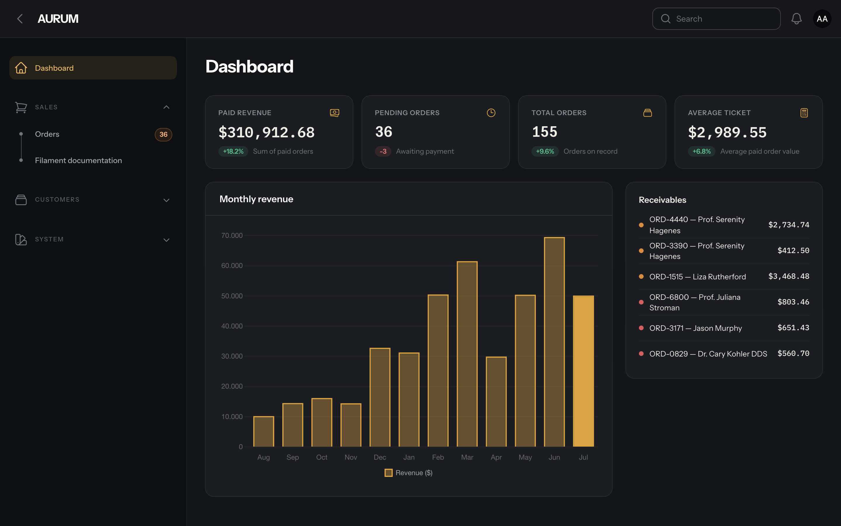
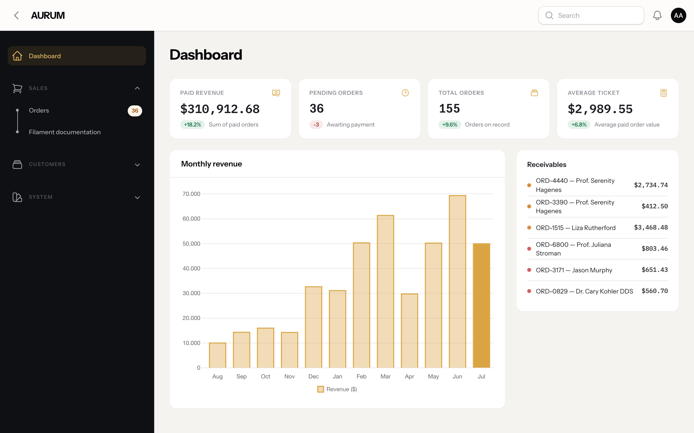
Gold (default) — dashboard
| Dashboard — dark | Dashboard — light |
|---|---|
 |
 |
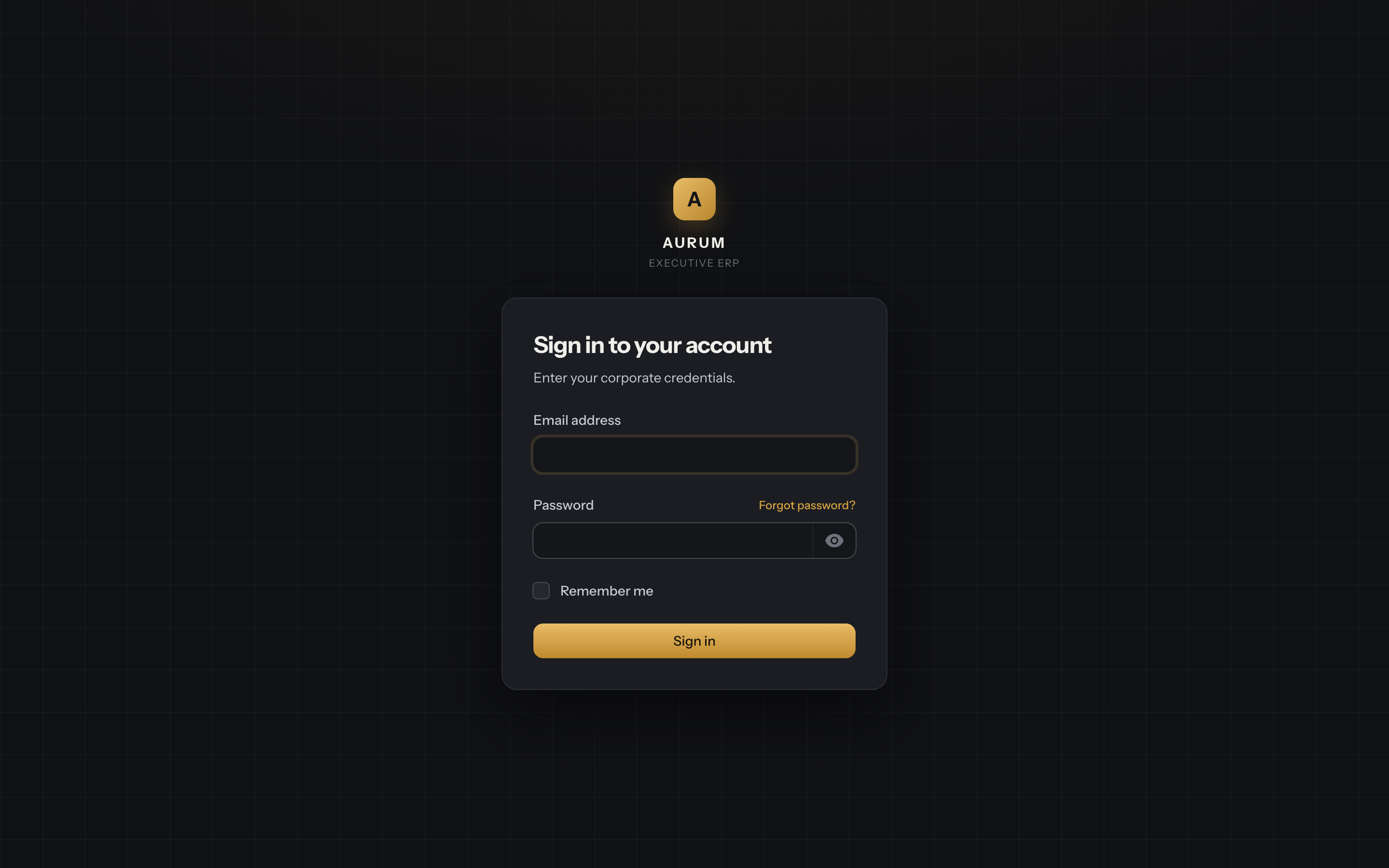
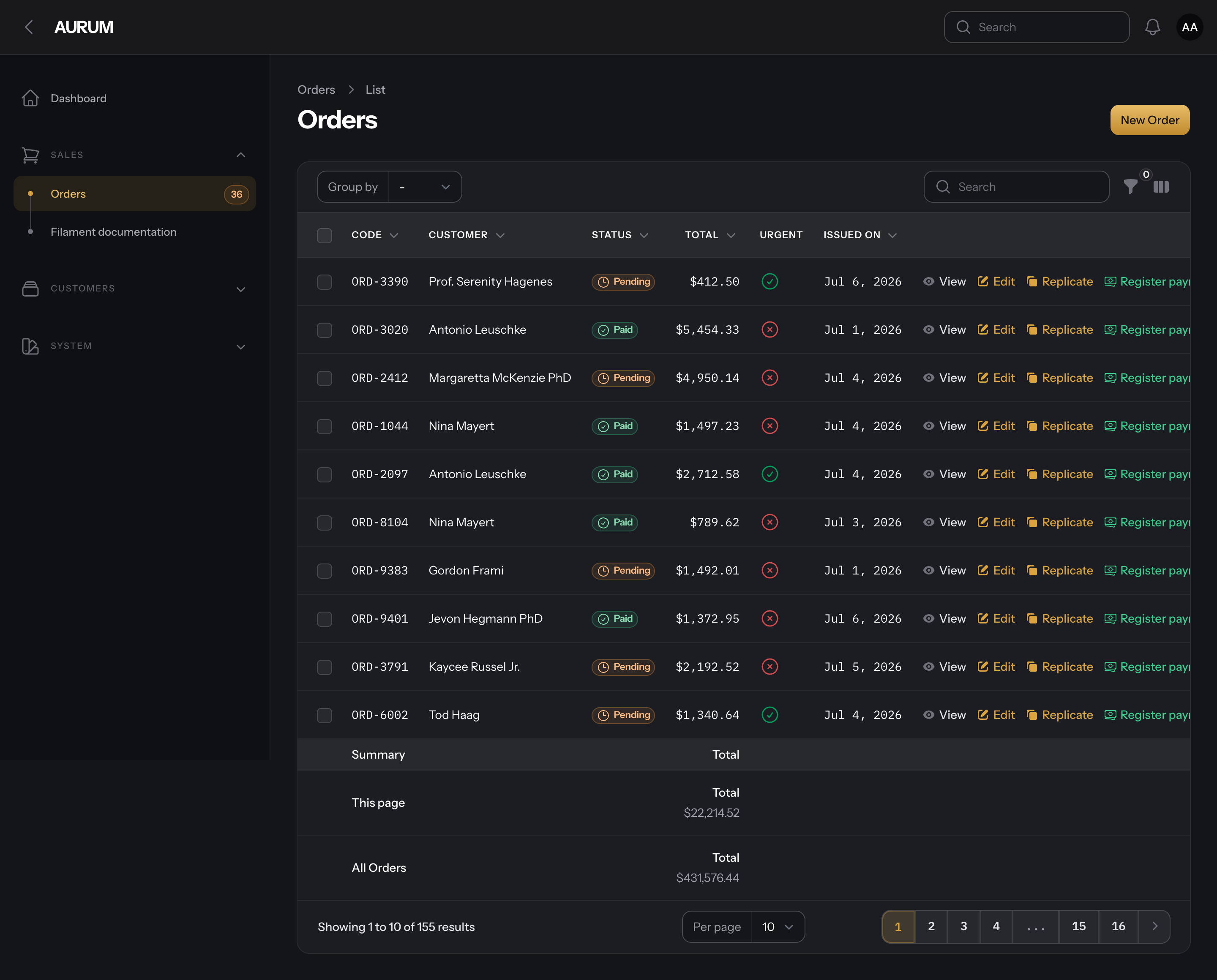
| Login | Orders |
|---|---|
 |
 |
Presets — dashboard, dark and light
| Preset | Dashboard — dark | Dashboard — light |
|---|---|---|
| Emerald | 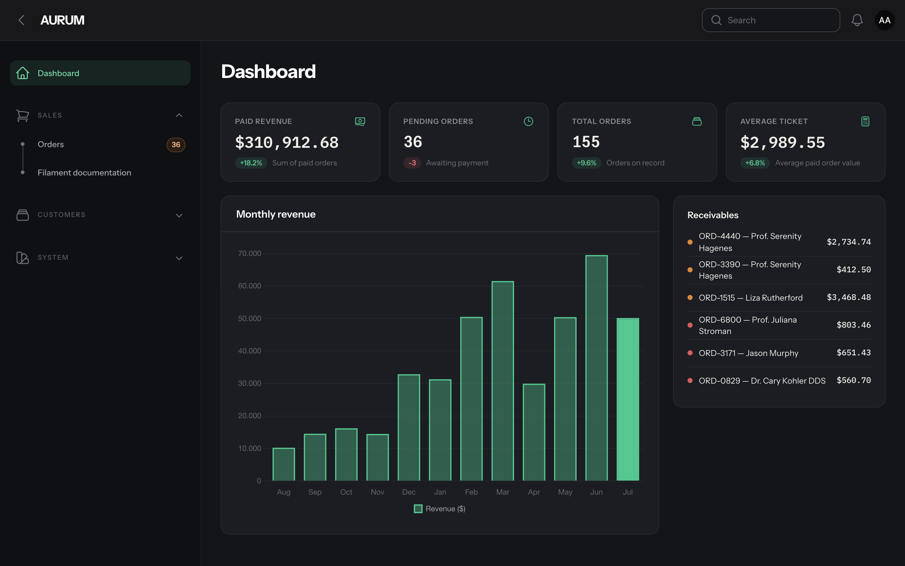 |
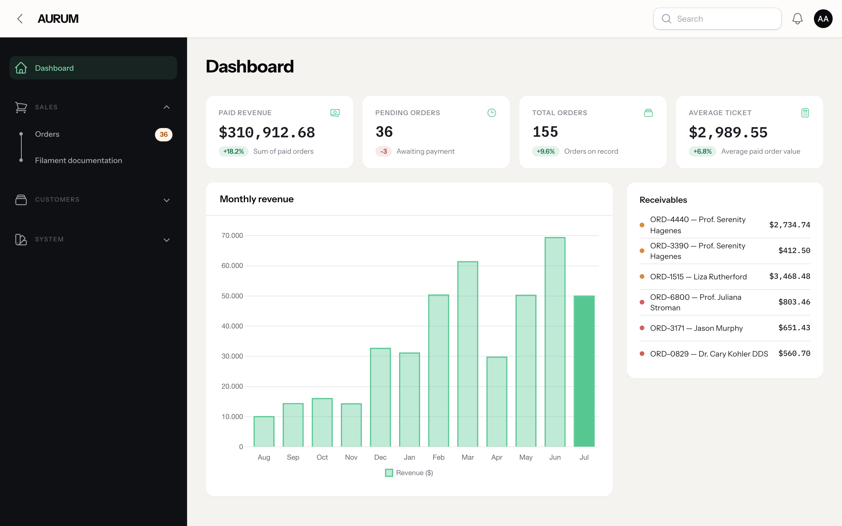 |
| Sapphire | 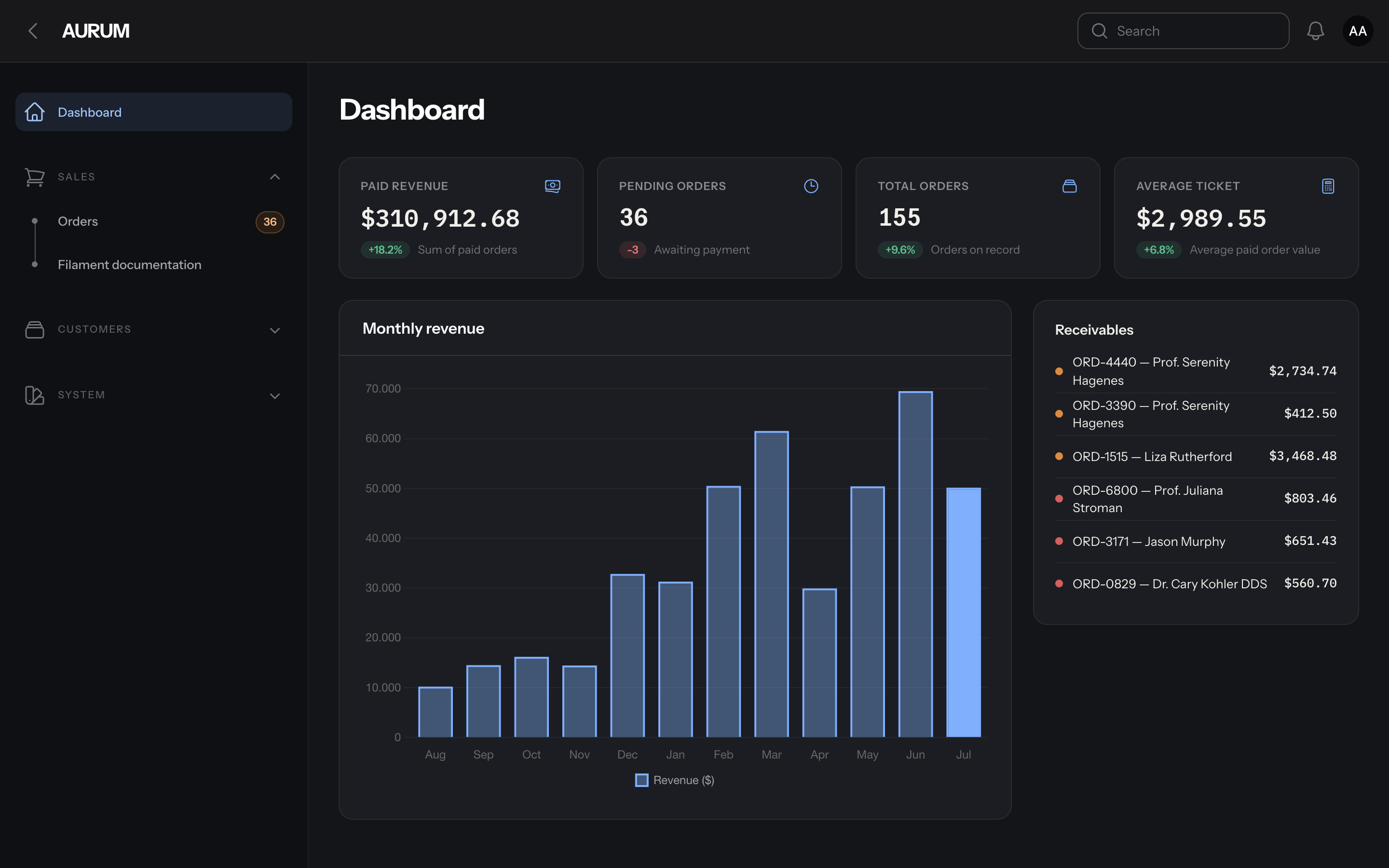 |
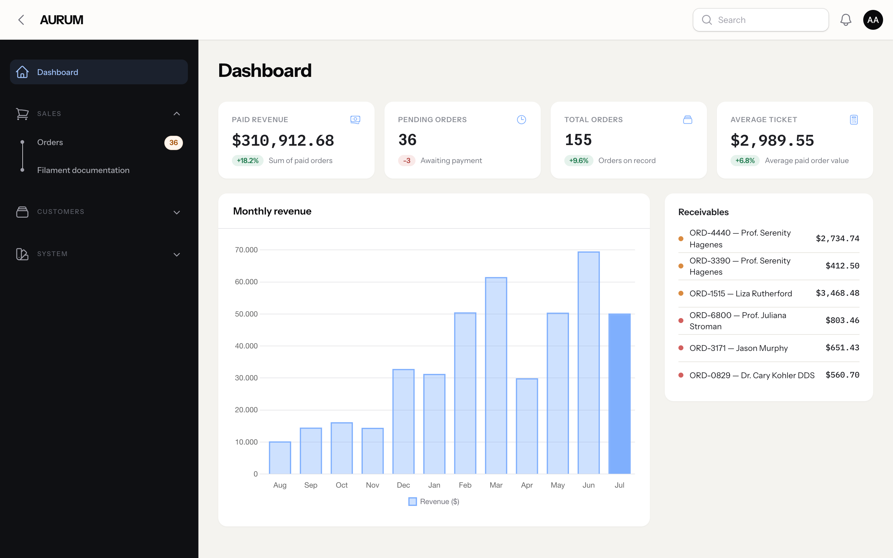 |
| Ruby | 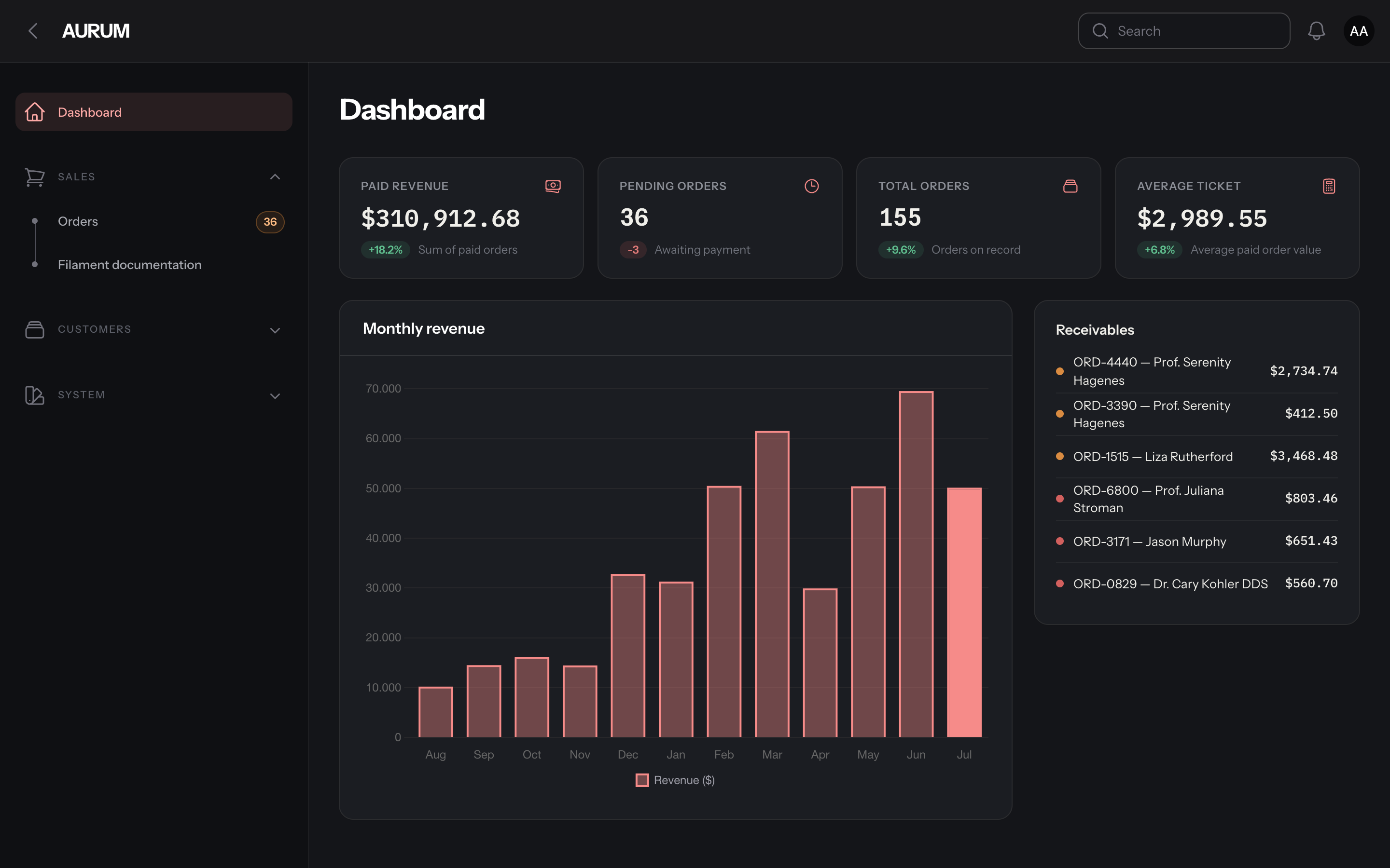 |
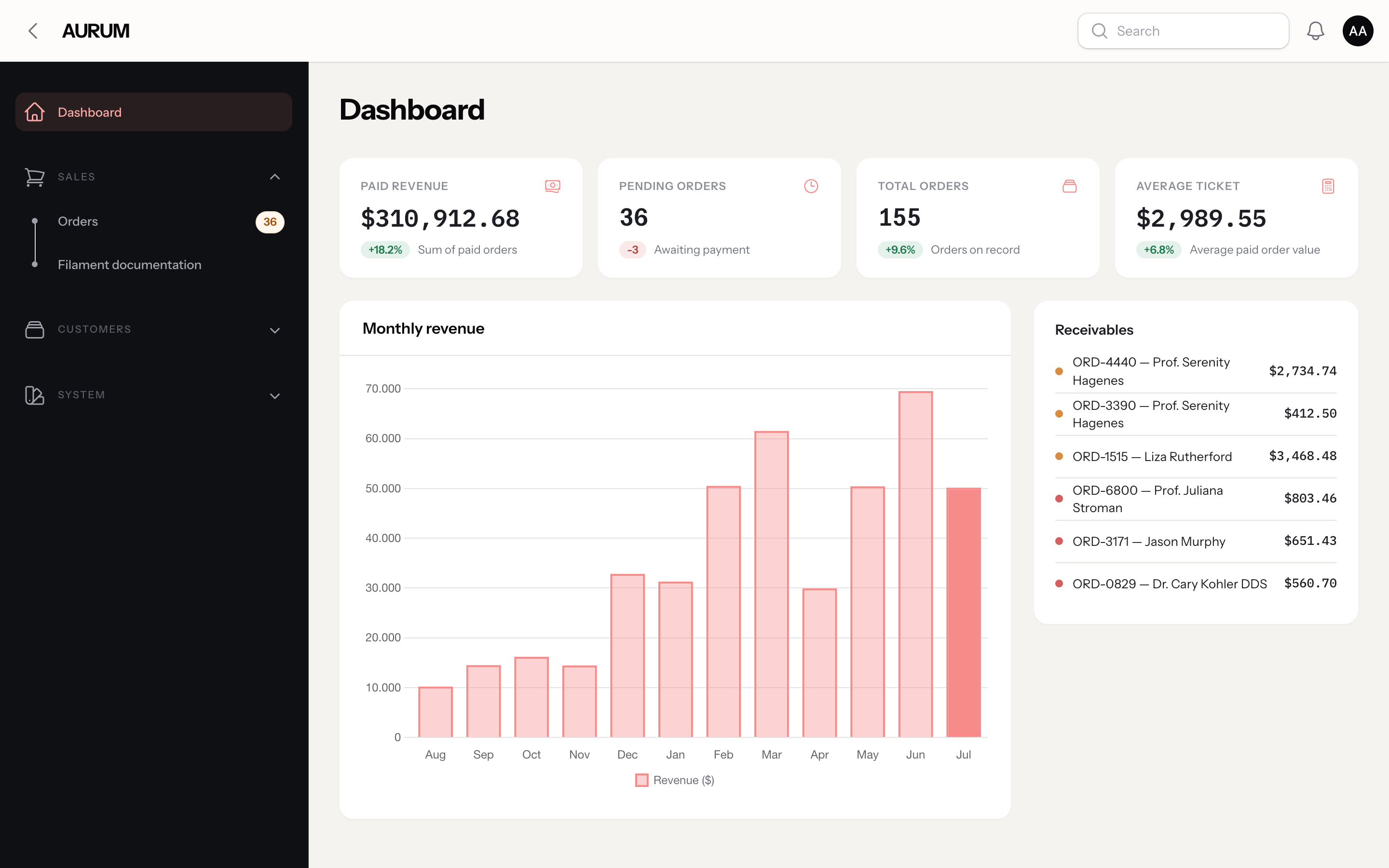 |
Preset login screenshots are in the Presets section below.
Features
- 4 curated presets — Gold (default), Emerald, Sapphire, Ruby — each an OKLCH 50–950 scale plus dark/light accent tokens.
- Always-dark sidebar signature — the sidebar stays dark even when the panel is in light mode.
- Executive typography — Instrument Sans for UI text, IBM Plex Mono with tabular figures (
.aurum-mono) for numeric columns. - Login brand block — a configurable logo + wordmark + tagline block rendered above the auth card on login, register, and password pages.
- 4 ready-made components —
AurumStatsOverview/AurumStat,AurumValueList,Timeline,TotalsBlock. - Zero-build install — the theme CSS is registered by the plugin; no Tailwind/Vite step required in the consuming app.
- Full dark + light modes, validated end to end against a real Filament v5.6.8 application.
Requirements
- PHP
^8.2 filament/filament^5.0
Contributing to this package (running the test suite) requires PHP
>= 8.3— see CONTRIBUTING.md.
Installation
In your PanelProvider:
Colors, fonts, and the theme CSS are registered by the plugin, scoped to the panel it is attached to — panels without ->plugin(AurumTheme::make()) are left untouched. No build step is required in the consuming app.
Presets
Aurum ships four color presets. Gold is the default; switch with ->preset():
| Preset | Login | Class |
|---|---|---|
| Gold (default) | |
ThalysJuvenal\Aurum\Presets\Gold |
| Emerald | 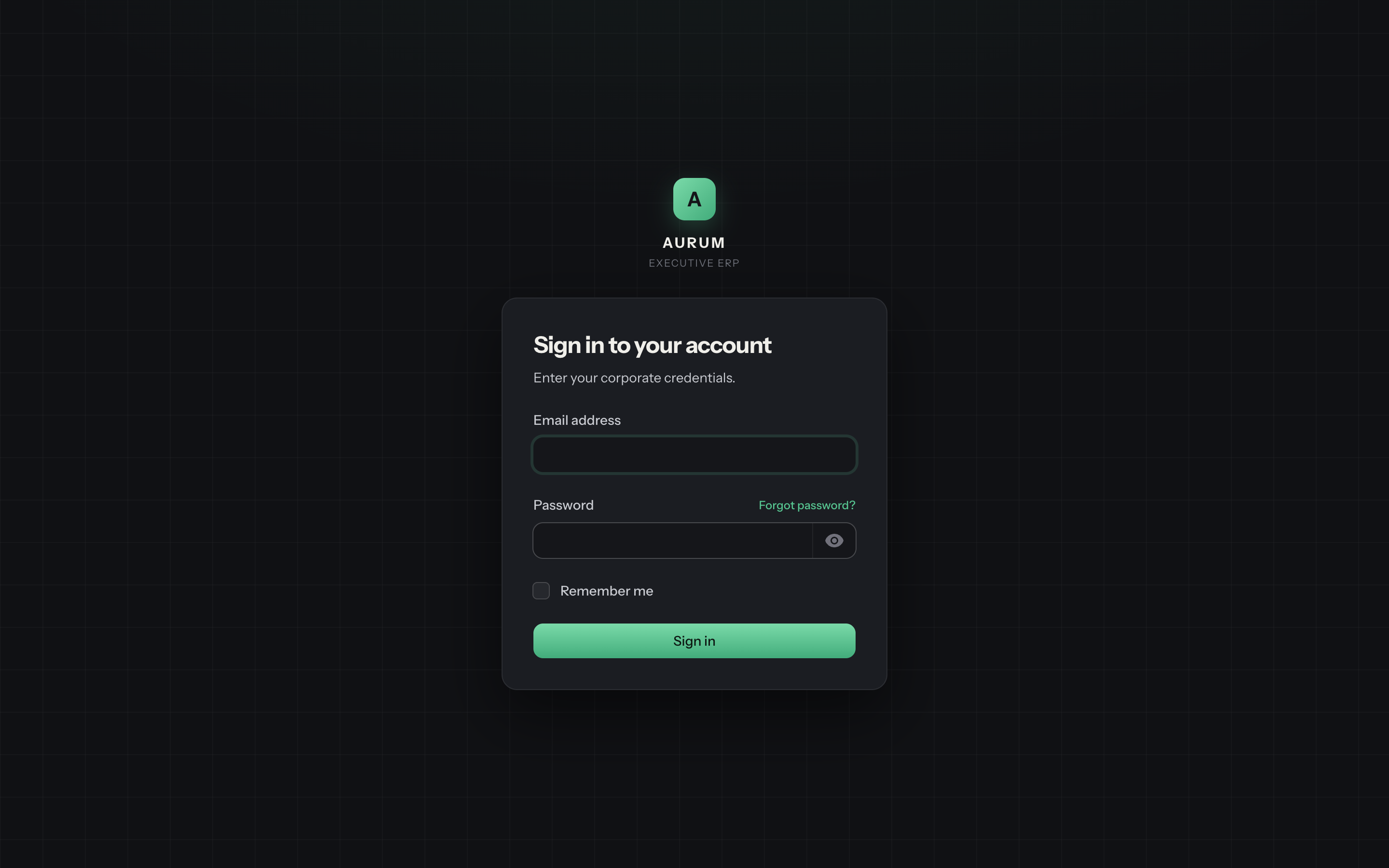 |
ThalysJuvenal\Aurum\Presets\Emerald |
| Sapphire | 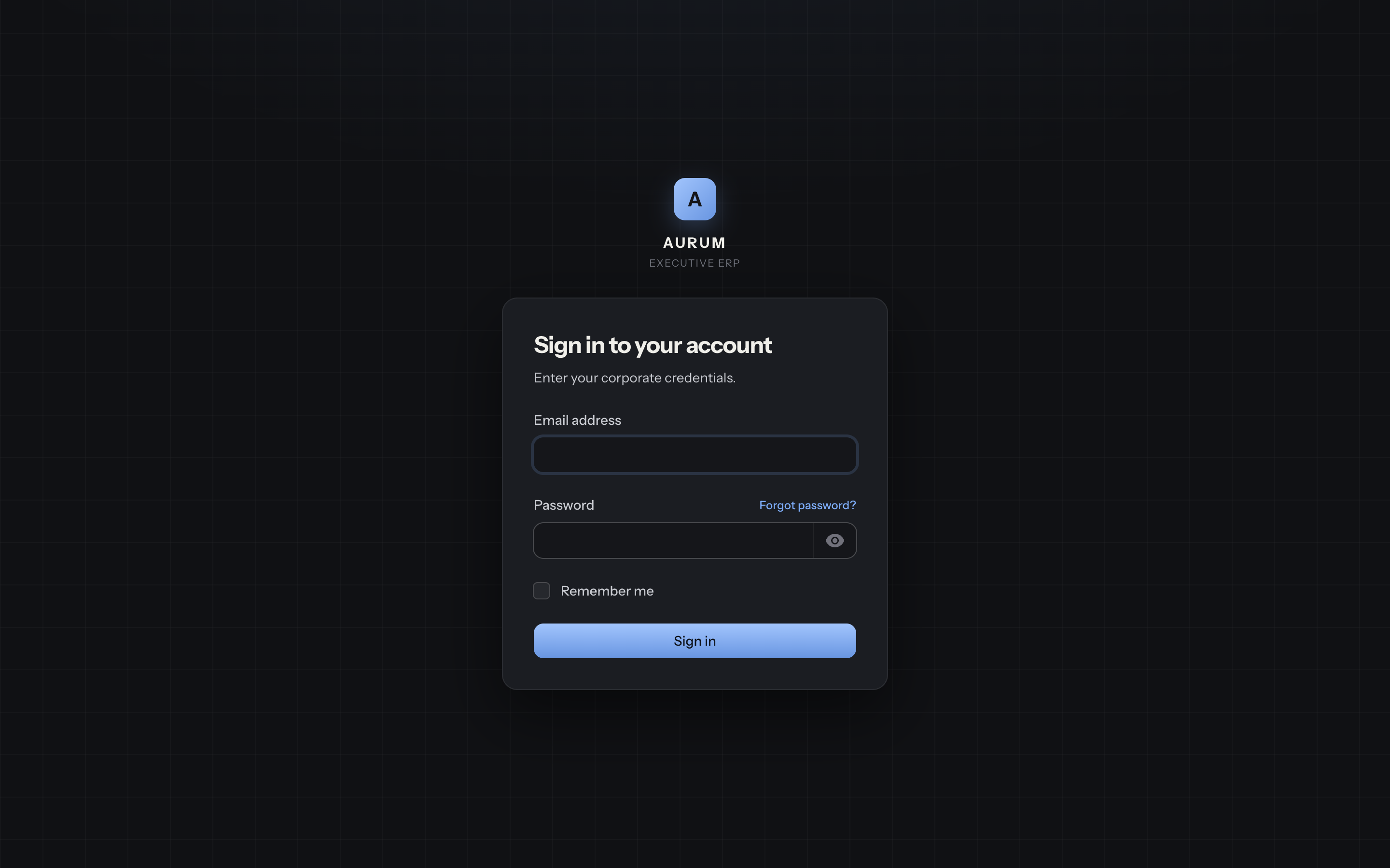 |
ThalysJuvenal\Aurum\Presets\Sapphire |
| Ruby | 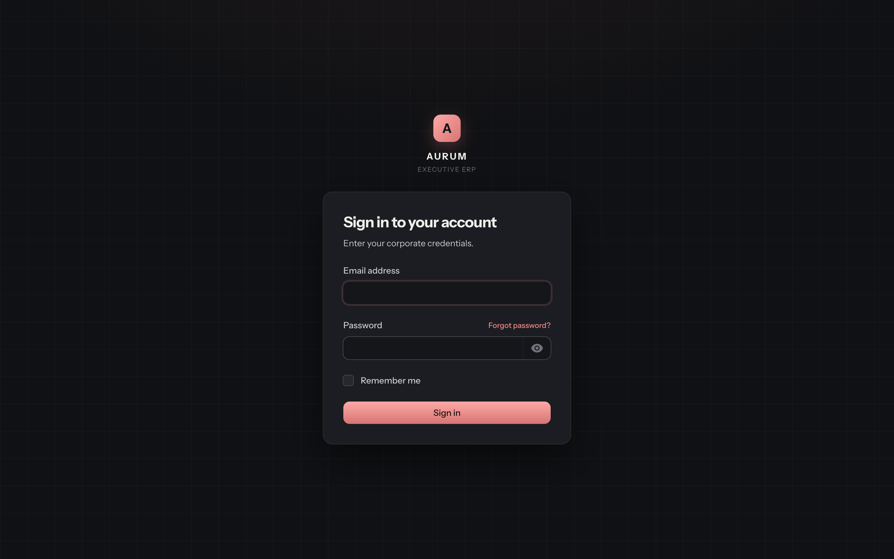 |
ThalysJuvenal\Aurum\Presets\Ruby |
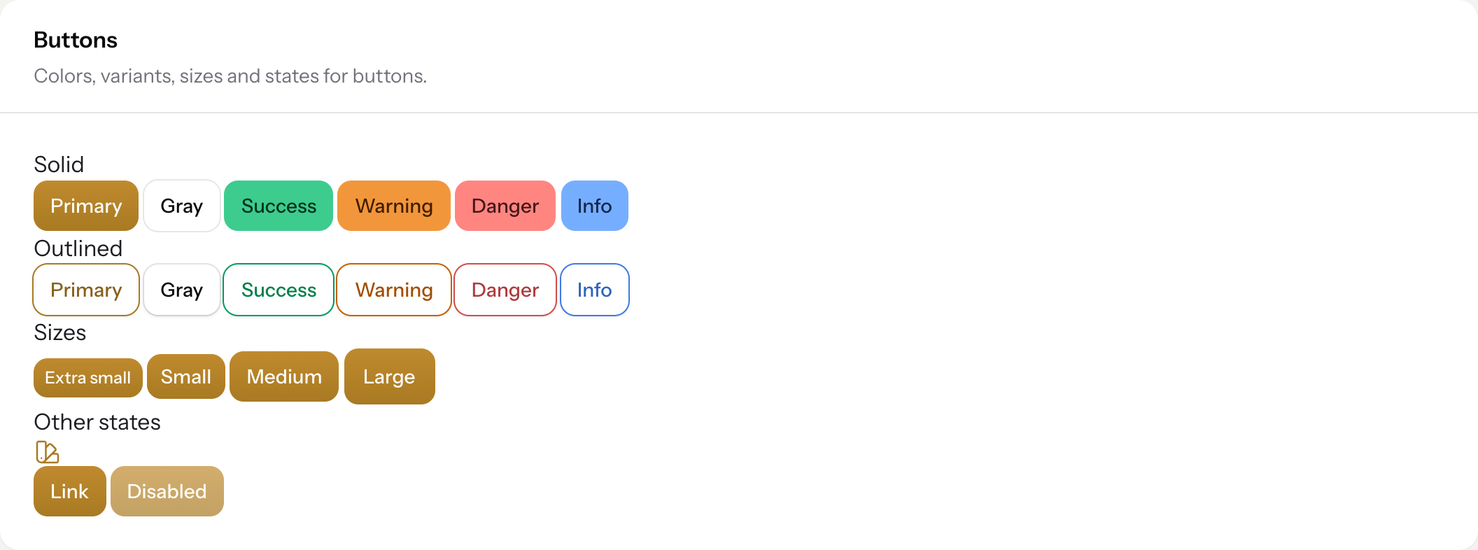
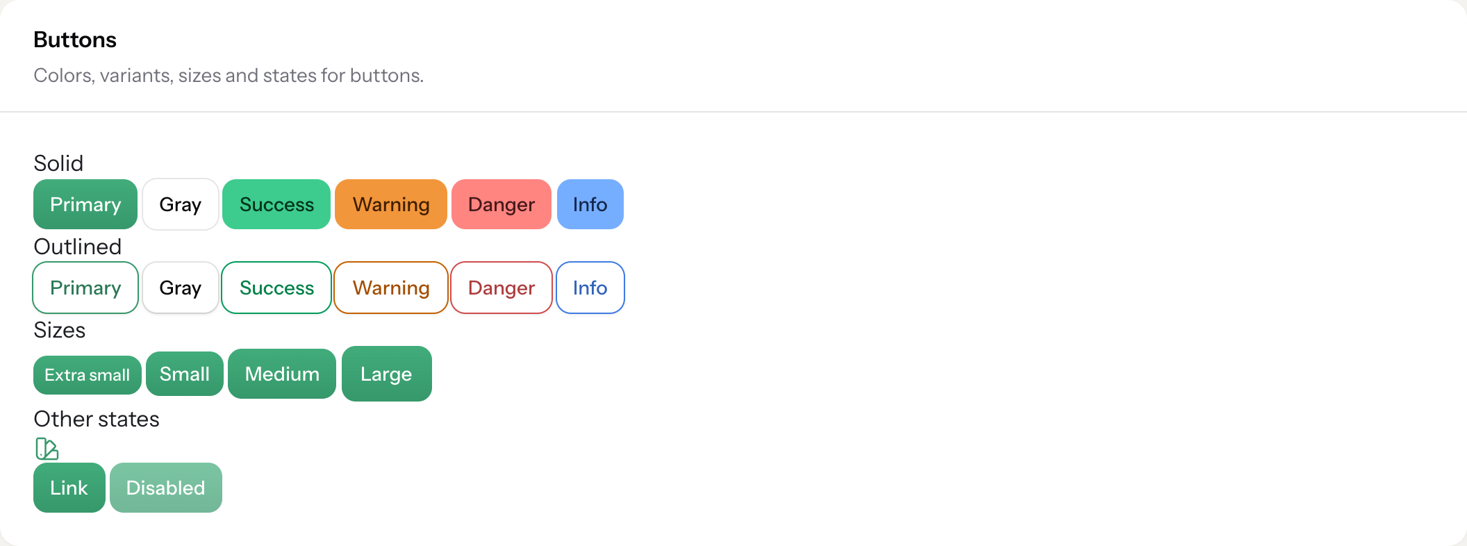
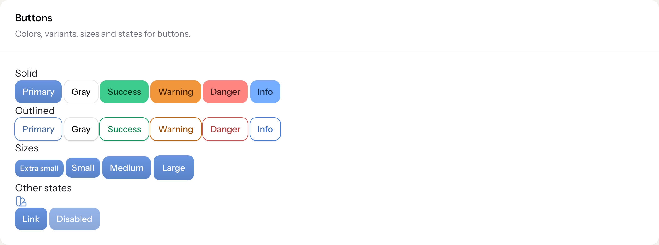
Buttons, per preset (light mode)
| Gold | Emerald | Sapphire | Ruby |
|---|---|---|---|
 |
 |
 |
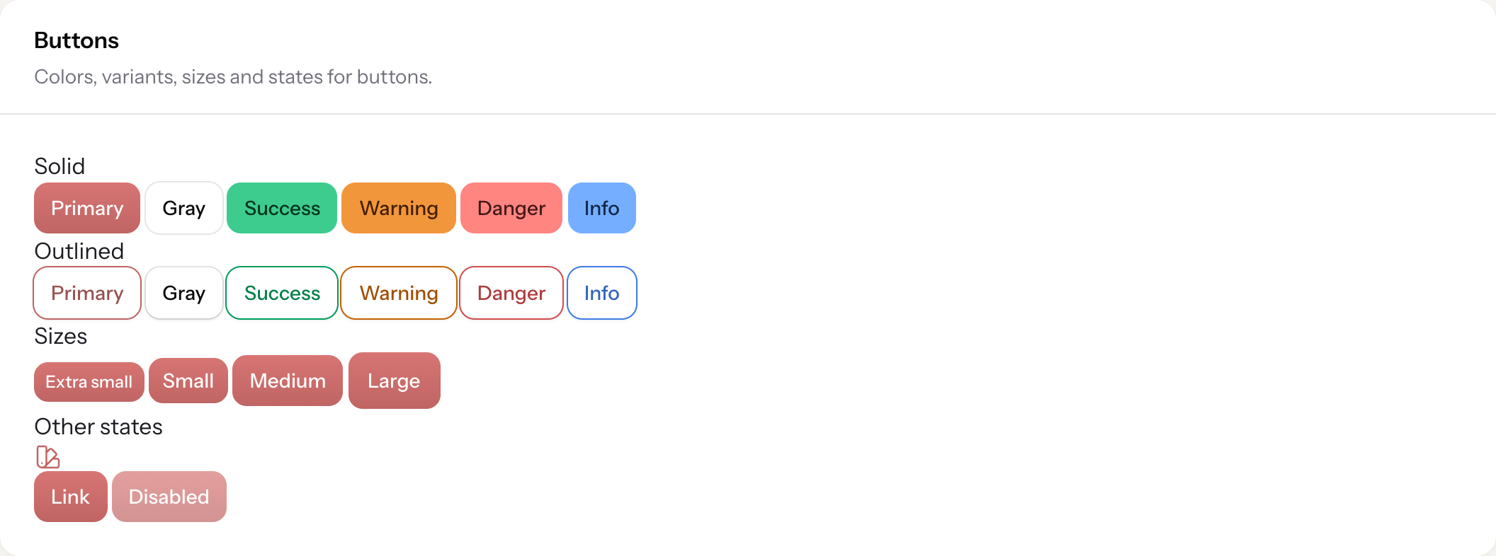 |
All four presets pass the package's WCAG contrast gates (tests/PresetContrastTest.php): AA for dark-mode button text, large-text AA for light-mode button text, and a minimum 3:1 accent-on-background ratio.
Custom presets
Extend AurumPreset and implement its three abstract methods — name(), palette() (an OKLCH 50–950 scale for $panel->colors()), and accentHex() (reference hex stops used to derive the --aurum-* CSS variables):
Then use it like any other preset: ->preset(Amethyst::class).
Components
Read the source under src/Widgets and src/Schemas for the full API; the examples below are copy-paste runnable.
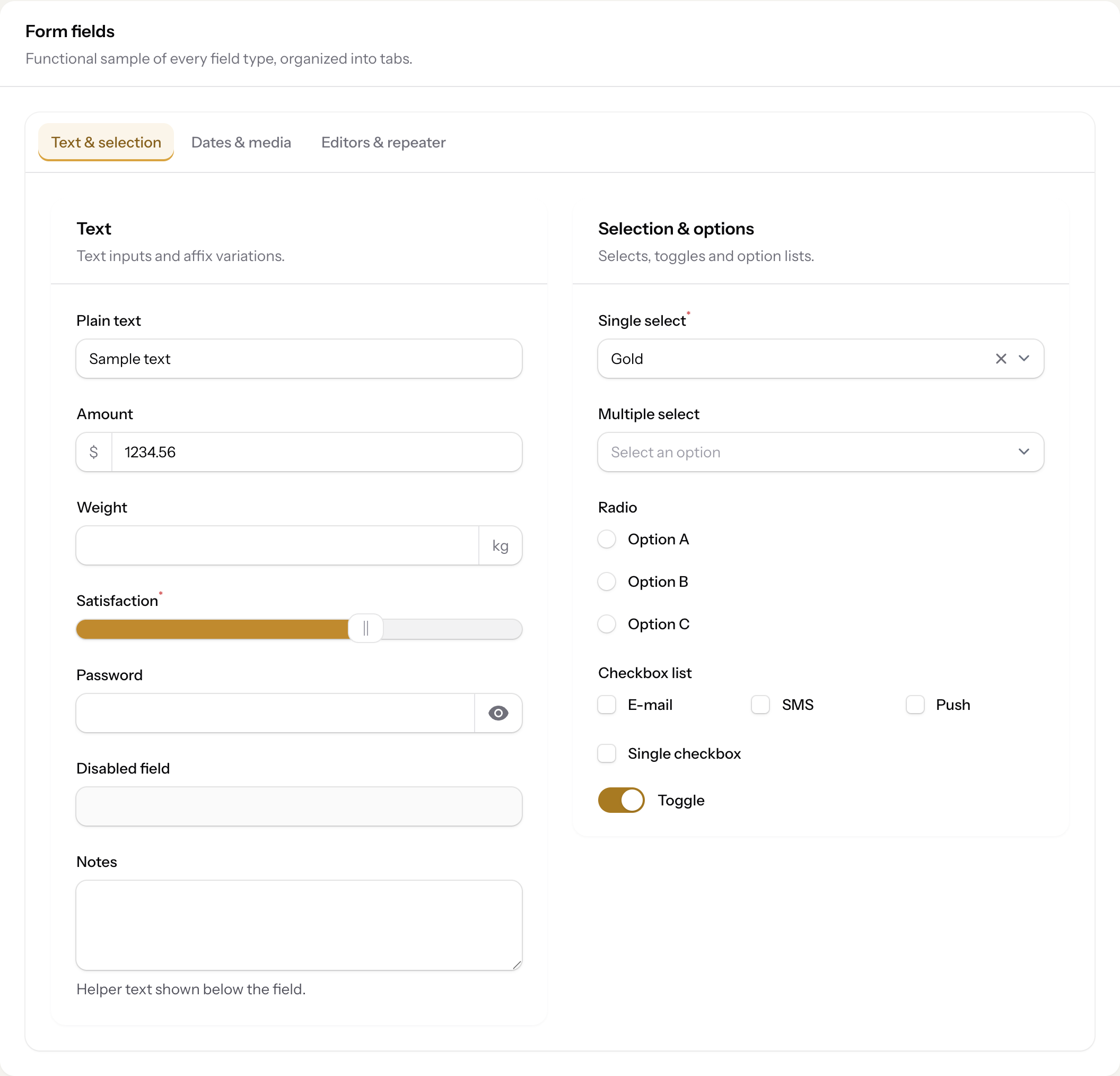
Forms
Every stock Filament field type themed end to end — text inputs with affixes, sliders, selects, radios, checkboxes, and toggles all pick up the active preset's accent automatically:
AurumStatsOverview + AurumStat
AurumValueList + ValueListItem
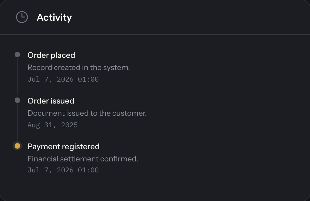
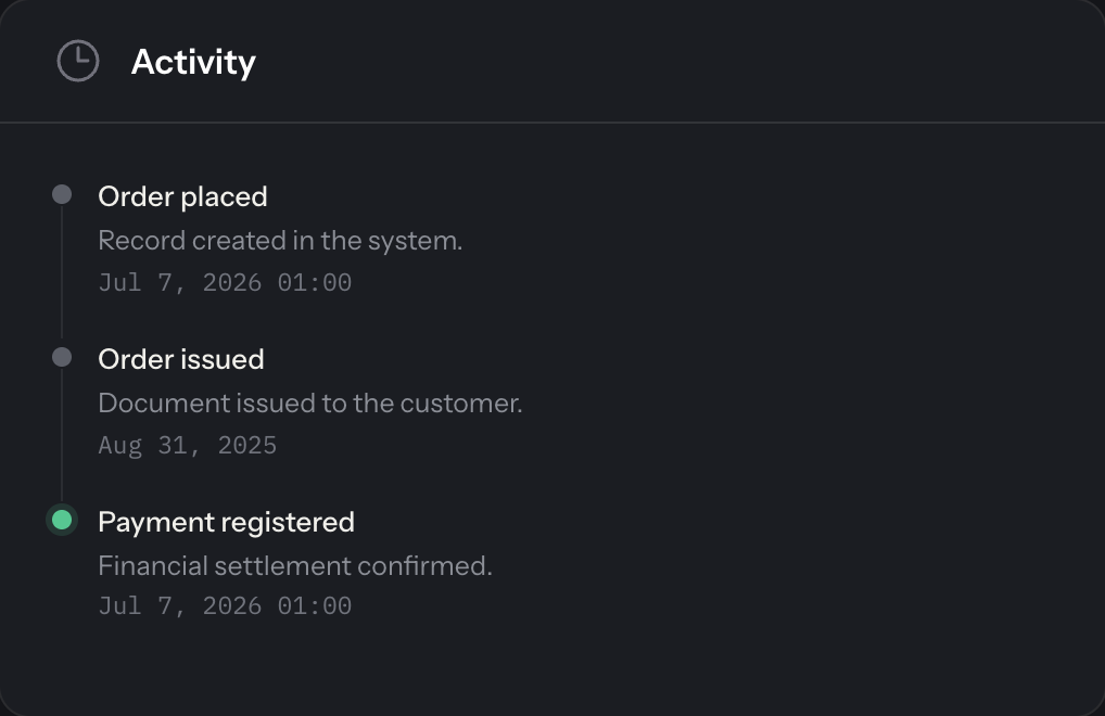
Timeline + TimelineItem
| Gold | Emerald | Sapphire | Ruby |
|---|---|---|---|
 |
 |
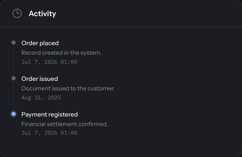 |
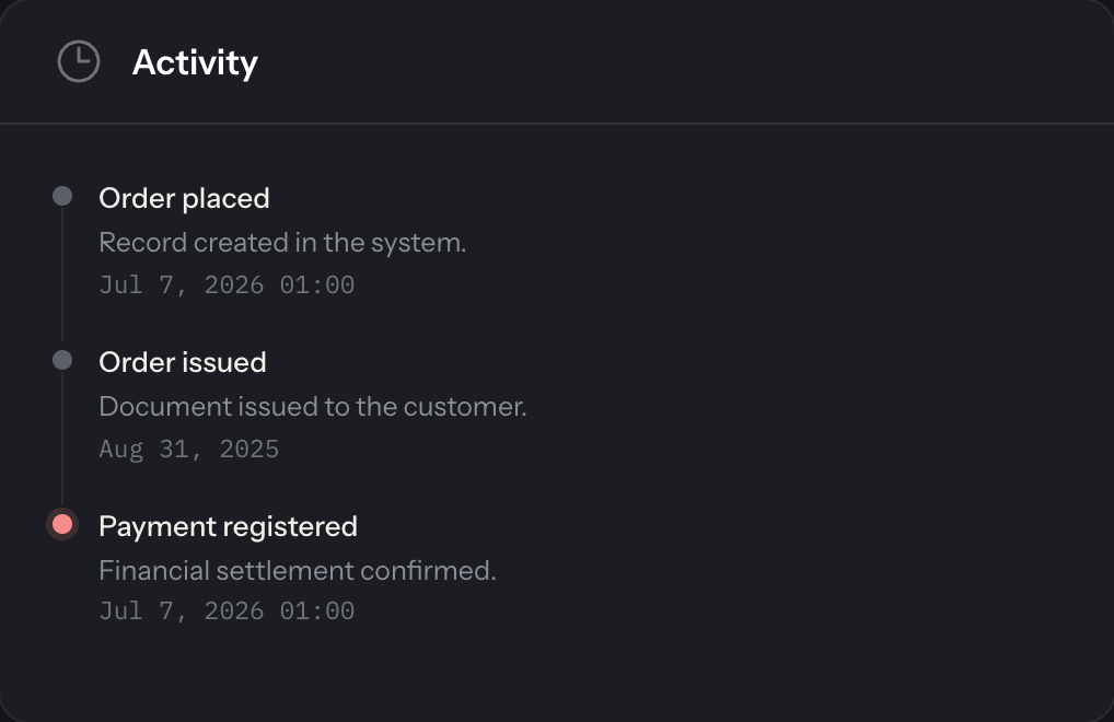 |
TotalsBlock + TotalsRow
| Dark | Light |
|---|---|
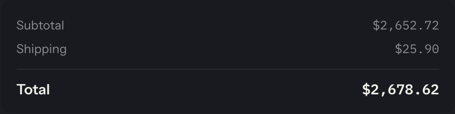 |
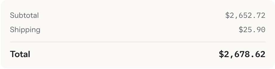 |
Theme-aware charts
AurumPreset exposes accentRgb() and accentRgba(float $alpha) so a ChartWidget can read the active preset's accent instead of hardcoding a color — bars follow whichever preset (Gold/Emerald/Sapphire/Ruby) the panel is configured with:
Login brand block
Configure a brand name and tagline rendered above the auth card on login, register, and password pages:
If brandName() is not set, the block falls back to the panel's own brand name at render time. If brandTagline() is not set, the tagline element is omitted entirely (no reserved space).
Using your own logo
By default the block renders a gradient square with the brand's initial. If the panel defines a logo, the block renders it instead:
The wordmark and tagline are still rendered below the logo unless you opt out:
hideBrandText() only takes effect when the panel has a logo — without one, the block would otherwise be left with nothing but an empty square, so the text always renders in that case.
The brand area is always dark, in both light and dark panel modes (it's the Aurum signature, see Compatibility and the login screenshots above). Because of this, the block prefers ->darkModeBrandLogo() over ->brandLogo() when both are set — supply a logo variant that reads well on a dark background (light mark/wordmark, or one with enough contrast). If you only have a single logo asset, make sure it's legible on dark before relying on ->brandLogo() alone.
Trim your logo asset first. An untrimmed PNG with a lot of transparent padding around the mark (common with exported app icons) renders tiny inside the fixed-height block — the height you set applies to the whole canvas, not just the visible mark, so padding shrinks the visible logo instead of the empty space. Trim the asset to its visible content (e.g. magick logo.png -trim +repage logo.png or sips on macOS) before publishing it.
Numeric columns
Apply the .aurum-mono utility class to currency, date, and code columns for IBM Plex Mono + tabular figures:
Optional Vite theme
For apps that compile their own Tailwind CSS alongside Aurum:
Then register it on the panel and add the published file to your vite.config.js input:
The Aurum theme CSS registered by the plugin keeps working as-is; the Vite stub is only needed if you also compile your own panel CSS.
Compatibility
The theme's CSS selectors (.fi-*) were validated against the real DOM of Filament v5.6.8, including systematic visual QA (light and dark modes) across the 10 areas of the official documentation: forms, schemas, tables, resources, infolists, actions, notifications, widgets, navigation, and users (modals, slide-overs, dropdowns, wizards/tabs, repeaters, pagination, bulk selection, database notifications, etc.). .fi-* class names are not covered by semver — minor Filament releases may rename them and require small adjustments to aurum.css.
Known limitations
- Collapsed sidebar width: Filament v5 uses a fixed 88px width in the collapsed state (not driven by a CSS variable); the original Aurum spec called for 64px. Forcing 64px via CSS decenters the icons (the padding is shared with the expanded state), so the theme keeps Filament's default 88px — icons, dark background, and the gold active item stay faithful to the spec.
- Google Fonts runtime dependency: the theme loads Instrument Sans via Filament's Google font provider, and IBM Plex Mono via a CSS
@importfromfonts.googleapis.com, both at runtime. Air-gapped or intranet deployments without internet access will silently fall back to system fonts, and organizations subject to GDPR may prefer not to have browsers requesting fonts from Google at all. Self-hosting or bundling both font families is on the roadmap.
Roadmap
Planned for v2:
- Per-user preset switching (persisted at the user level, not just panel-wide).
- RTL support.
- Density modes (compact/comfortable).
- Additional presets.
- Bundled/self-hosted fonts (remove the runtime dependency on Google Fonts).
Contributing
See CONTRIBUTING.md for PHP version requirements, development scripts, and the pull request checklist.
License
The MIT License (MIT). See LICENSE for more information.
