Download the PHP package protonemedia/laravel-form-components without Composer
On this page you can find all versions of the php package protonemedia/laravel-form-components. It is possible to download/install these versions without Composer. Possible dependencies are resolved automatically.
Download protonemedia/laravel-form-components
More information about protonemedia/laravel-form-components
Files in protonemedia/laravel-form-components
Package laravel-form-components
Short Description Blade components to rapidly build forms with Tailwind CSS Custom Forms and Bootstrap 4.
License MIT
Homepage https://github.com/protonemedia/laravel-form-components
FAQ
Example:

In general, it is recommended to use always a project to download your libraries. In an application normally there is more than one library needed.

- Some hosting areas are not accessible by a terminal or SSH. Then it is not possible to use Composer.
- To use Composer is sometimes complicated. Especially for beginners.
- Composer needs much resources. Sometimes they are not available on a simple webspace.
- If you are using private repositories you don't need to share your credentials. You can set up everything on our site and then you provide a simple download link to your team member.
- Simplify your Composer build process. Use our own command line tool to download the vendor folder as binary. This makes your build process faster and you don't need to expose your credentials for private repositories.
Informations about the package laravel-form-components
:warning: This package is deprecated. It doesn't support Livewire 3 and Tailwind 3 and won't be maintained anymore.
Laravel Form Components


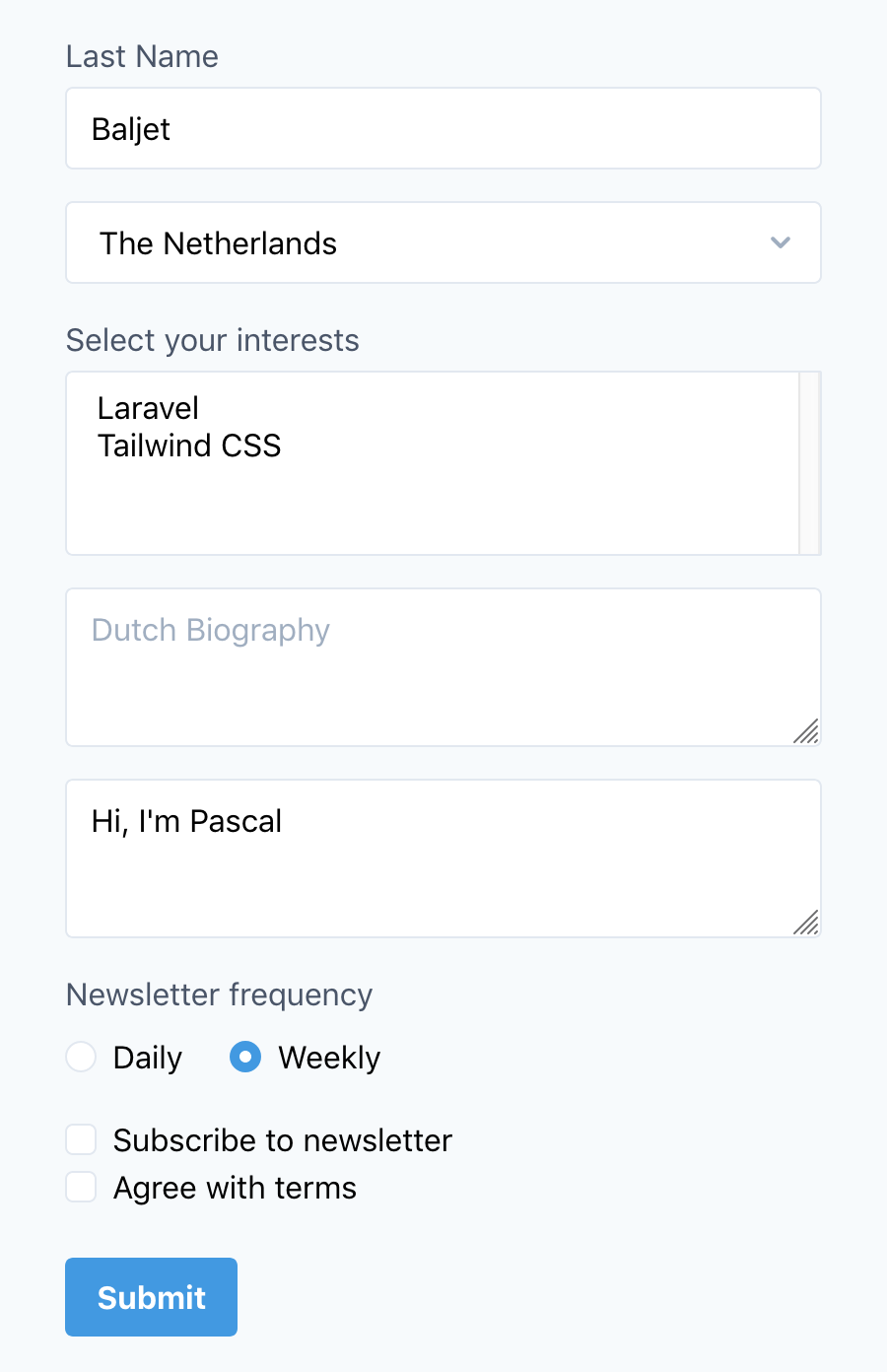
A set of Blade components to rapidly build forms with Tailwind CSS v1, Tailwind CSS v2, Bootstrap 4 and Bootstrap 5. Supports validation, model binding, default values, translations, includes default vendor styling and fully customizable!
Sponsor this package!
❤️ We proudly support the community by developing Laravel packages and giving them away for free. If this package saves you time or if you're relying on it professionally, please consider sponsoring the maintenance and development. Keeping track of issues and pull requests takes time, but we're happy to help!
Laravel Splade
Did you hear about Laravel Splade? 🤩
It's the magic of Inertia.js with the simplicity of Blade. Splade provides a super easy way to build Single Page Applications using Blade templates. Besides that magic SPA-feeling, it comes with more than ten components to sparkle your app and make it interactive, all without ever leaving Blade.
Features
📺 Want to see this package in action? Join the live stream on November 19 at 14:00 CET: https://youtu.be/7eNZS4U7xyM
- Components for input, textarea, select, multi-select, checkbox and radio elements.
- Support for Tailwind v1 with Tailwind CSS Custom Forms.
- Support for Tailwind v2 with Tailwind Forms.
- Support for Bootstrap 4 Forms.
- Support for Bootstrap 5 Forms.
- Component logic independent from Blade views, the Tailwind and Bootstrap views use the same logic.
- Bind a target to a form (or a set of elements) to provide default values (model binding).
- Support for Laravel Livewire v2.
- Support for Spatie's laravel-translatable.
- Re-populate forms with old input.
- Validation errors.
- Form method spoofing.
- Components classes and Blade views fully customizable.
- Support for prefixing the components.
Requirements
- PHP 8.0 or higher
- Laravel 9.0
Installation
You can install the package via composer:
If you're using Tailwind, make sure the right plugin (v1 or v2) is installed and configured.
Quick example
Preface
At first sight, generating HTML forms with PHP looks great. PHP's power can make it less repetitive, and it's nice to resolve input values and validation states right from your PHP code. Still, it gets harder to keep your PHP code clean and neat whenever your forms get more complex. Often you end up with lots of custom code, writing extensions, and overriding defaults, just for the sake of adding some small thing to your form.
After years of trying all sorts of form builders, it feels like just writing most of the form in HTML is the most versatile solution. You can add helper texts, icons, tooltips, popovers, custom sections, and JavaScript integrations however and wherever you like. The power of Laravel Blade Components allows us to add all kinds of features without bringing the whole form-building process into PHP.
Let's take a look at this x-form example. The action attribute is optional, but you can pass a hard-coded, primitive value to the component using a simple HTML attribute. Likewise, PHP expressions and variables can be passed to attributes using the : prefix. Do you need Alpine.js or VueJS directives? No problem!
Configuration
You can switch frameworks by updating the framework setting in the form-components.php configuration file. Check out the Livewire Stack with Laravel Jetstream, you probably want to set the framework configuration key to tailwind-forms-simple.
No further configuration is needed unless you want to customize the Blade views and components.
Usage
Input and textarea elements
The minimum requirement for an input or textarea is the name attribute.
Optionally you can add a label attribute, which can be computed as well.
You can also choose to use a placeholder instead of a label, and of course you can change the type of the element.
By default, every element shows validation errors, but you can hide them if you want.
Default value and binds
You can use the default attribute to specify the default value of the element.
Binding a target
Instead of setting a default value, you can also pass in a target, like an Eloquent model. Now the component will get the value from the target by the name.
In the example above, where $video is an Eloquent model, the default value will be $video->description.
Date Casting
If you use Eloquent's Date Casting feature, you can use the date attributes in your forms by setting the use_eloquent_date_casting configuration key to true. For compatibility reasons, this is disabled by default.
You can either use the dates property or the casts property in your Eloquent model to specify date attributes:
In the example above, the default value will be formatted like 31-10-2021.
Binding a target to multiple elements
You can also bind a target by using the @bind directive. This will bind the target to all elements until the @endbind directive.
You can even mix targets!
Override or remove a binding
You can override the @bind directive by passing a target directly to the element using the :bind attribute. If you want to remove a binding for a specific element, pass in false.
Laravel Livewire
You can use the @wire and @endwire directives to bind a form to a Livewire component. Let's take a look at the ContactForm example from the official Livewire documentation.
Normally you would use a wire:model attribute to bind a component property with a form element. By using the @wire directive, this package will automatically add the wire:model attribute.
Additionally, you can pass an optional modifier to the @wire directive. This feature was added in v2.4.0. If you're upgrading from a previous version and you published the Blade views, you should republish them or update them manually.
It's also possible to use the wire:model attribute by default. You may set the default_wire configuration setting to true or a modifier like debounce.500ms. This way, you don't need the @wire and @endwire directives in your views. You may still override the default setting by using the @wire directive, or by manually adding the wire:model attribute to a form element.
Select elements
Besides the name attribute, the select element has a required options attribute, which should be a simple key-value array.
You can provide a slot to the select element as well:
If you want a select element where multiple options can be selected, add the multiple attribute to the element. If you specify a default, make sure it is an array. This applies to bound targets as well.
You may add a placeholder attribute to the select element. This will prepend a disabled option.
This feature was added in v3.2.0. If you're upgrading from a previous version and you published the Blade views, you should republish them or update them manually.
Rendered HTML:
Using Eloquent relationships
This package has built-in support for BelongsToMany, MorphMany, and MorphToMany relationships. To utilize this feature, you must add both the multiple and many-relation attribute to the select element.
In the example below, you can attach one or more tags to the bound video. By using the many-relation attribute, it will correctly retrieve the selected options (attached tags) from the database.
Checkbox elements
Checkboxes have a default value of 1, but you can customize it as well.
If you have a fieldset of multiple checkboxes, you can group them together with the form-group component. This component has an optional label attribute and you can set the name as well. This is a great way to handle the validation of arrays. If you disable the errors on the individual checkboxes, it will one show the validation errors once. The form-group component has a show-errors attribute that defaults to true.
Radio elements
Radio elements behave exactly the same as checkboxes, except the show-errors attribute defaults to false as you almost always want to wrap multiple radio elements in a form-group.
You can group checkbox and radio elements on the same horizontal row by adding an inline attribute to the form-group element.
When you're not using target binding, you can use the default attribute to mark a radio element as checked:
Old input data
When a validation errors occurs and Laravel redirects you back, the form will be re-populated with the old input data. This old data will override any binding or default value.
Handling translations
This package supports spatie/laravel-translatable out of the box. You can add a language attribute to your element.
This will result in the following HTML:
To get the validation errors from the session, the name of the input will be mapped to a dot notation like title.en. This is how old input data is handled as well.
Customize the blade views
Publish the configuration file and Blade views with the following command:
You can find the Blade views in the resources/views/vendor/form-components folder. Optionally, in the form-components.php configuration file, you can change the location of the Blade view per component.
Component logic
You can bind your own component classes to any of the elements. In the form-components.php configuration file, you can change the class per component. As the logic for the components is quite complex, it is strongly recommended to duplicate the default component as a starting point and start editing. You'll find the default component classes in the vendor/protonemedia/laravel-form-components/src/Components folder.
Prefix the components
You can define a prefix in the form-components.php configuration file.
Now all components can be referenced like so:
Error messages
By the default, the errors messages are positioned under the element. To show these messages, we created a FormErrors component. You can manually use this component as well. The element takes an optional bag attribute to specify the ErrorBag, which defaults to default.
Submit button
The label defaults to Submit, but you can use the slot to provide your own content.
Bootstrap
You can switch to Bootstrap 4 or Bootstrap 5 by updating the framework setting in the form-components.php configuration file.
There is a little of styling added to the form.blade.php view to add support for inline form groups. If you want to change it or remove it, publish the assets and update the view file.
Bootstrap 5 changes a lot regarding forms. If you migrate from 4 to 5, make sure to read the migration logs about forms.
Input group / prepend and append
In addition to the Tailwind features, with Bootstrap 4, there is also support for input groups. Use the prepend and append slots to provide the contents.
With Bootstrap 5, the input groups have been simplified. You can add as many items as you would like in any order you would like. Use the form-input-group-text component to add text or checkboxes.
Floating labels
As of Bootstrap 5, you can add floating labels by adding the floating attribute to inputs, selects (excluding multiple), and textareas.
Help text
You can add block-level help text to any element by using the help slot.
Testing
Changelog
Please see CHANGELOG for more information about what has changed recently.
Contributing
Please see CONTRIBUTING for details.
Other Laravel packages
Laravel Analytics Event Tracking: Laravel package to easily send events to Google Analytics.Laravel Blade On Demand: Laravel package to compile Blade templates in memory.Laravel Cross Eloquent Search: Laravel package to search through multiple Eloquent models.Laravel Eloquent Scope as Select: Stop duplicating your Eloquent query scopes and constraints in PHP. This package lets you re-use your query scopes and constraints by adding them as a subquery.Laravel Eloquent Where Not: This Laravel package allows you to flip/invert an Eloquent scope, or really any query constraint.Laravel FFMpeg: This package provides an integration with FFmpeg for Laravel. The storage of the files is handled by Laravel's Filesystem.Laravel Paddle: Paddle.com API integration for Laravel with support for webhooks/events.Laravel Verify New Email: This package adds support for verifying new email addresses: when a user updates its email address, it won't replace the old one until the new one is verified.Laravel WebDAV: WebDAV driver for Laravel's Filesystem.
Security
If you discover any security related issues, please email [email protected] instead of using the issue tracker.
Credits
- Pascal Baljet
- All Contributors
License
The MIT License (MIT). Please see License File for more information.
Treeware
This package is Treeware. If you use it in production, then we ask that you buy the world a tree to thank us for our work. By contributing to the Treeware forest you’ll be creating employment for local families and restoring wildlife habitats.
All versions of laravel-form-components with dependencies

illuminate/support Version ^9.0 || ^10.0
symfony/http-foundation Version ^6.0