Download the PHP package programmingwormhole/filapayer without Composer
On this page you can find all versions of the php package programmingwormhole/filapayer. It is possible to download/install these versions without Composer. Possible dependencies are resolved automatically.
Download programmingwormhole/filapayer
More information about programmingwormhole/filapayer
Files in programmingwormhole/filapayer
Package filapayer
Short Description A premium finance dashboard theme for Filament v5 — dark navy shell, design-token CSS layer and a library of finance UI components.
License MIT
Homepage https://github.com/programmingwormhole/filapayer
FAQ
Example:
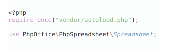
In general, it is recommended to use always a project to download your libraries. In an application normally there is more than one library needed.
- Some hosting areas are not accessible by a terminal or SSH. Then it is not possible to use Composer.
- To use Composer is sometimes complicated. Especially for beginners.
- Composer needs much resources. Sometimes they are not available on a simple webspace.
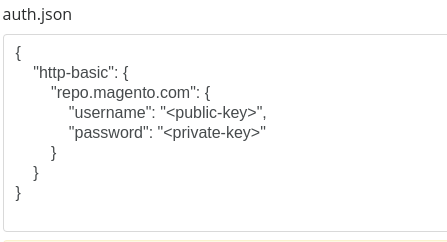
- If you are using private repositories you don't need to share your credentials. You can set up everything on our site and then you provide a simple download link to your team member.
- Simplify your Composer build process. Use our own command line tool to download the vendor folder as binary. This makes your build process faster and you don't need to expose your credentials for private repositories.
Informations about the package filapayer
FilaPayer — a finance dashboard theme for Filament v5
A complete, opinionated design system for Filament v5 panels: a dark navigation rail, a light content canvas, a semantic design-token layer and 20 finance UI components — cards, statement charts, wallet artwork, masked identifiers, money formatting.
It is a theme, not a starter kit. There are no migrations, models or seeders: it dresses the panel you already have. Every part of it is switchable, so you can take the stylesheet and leave the shell, or the shell and leave the SPA mode.
No build step. The stylesheet ships compiled. composer require, php artisan filament:assets,
register the plugin — no Node, no Tailwind config, no make:filament-theme.
Requirements
| PHP | 8.2+ |
| Laravel | 12.x |
| Filament | 5.7+ |
| Livewire | 4.1+ (what Filament v5 requires) |
No ext-intl. Money is formatted with plain PHP so it runs on a stock install.
Installation
Then register the plugin on your panel:
That is the whole installation. Load the panel and it is themed.
filament:assetsis not one-off. It copies the stylesheet intopublic/css/, so it belongs in your deploy script alongsidemigrateandoptimize— exactly as Filament's own docs prescribe for any panel with assets. Skip it and the panel renders unstyled.
Put ->plugin() first
Filament applies panel settings last-call-wins, and the plugin sets several (colors,
maxContentWidth, sidebarWidth, theme, spa, defaultAvatarProvider) the moment ->plugin()
runs. Anything you set after it wins — which is the escape hatch for one-off overrides, but a
surprise if you did not intend it:
What you get
The shell. A dark navy sidebar with grouped navigation, a full-width active pill, badges, a
light/dark segmented toggle in the footer, and a topbar carrying the page title, global search,
database notifications and a restyled profile menu. Both are Livewire components swapped in through
Filament's own sidebarLivewireComponent() / topbarLivewireComponent() hooks, so render hooks,
SPA navigation and mobile drawer behaviour are untouched.
The stylesheet. ~2,300 lines layered on top of Filament's own theme, never replacing it: a token layer (light + dark), a type scale, surface/field/badge primitives, shell chrome, and targeted alignment of native Filament components (tables, forms, modals, notifications) to the same visual language. Native Filament components keep working and adopt the design.
A guest split screen. Sign-in, register and password-reset pages get a dark brand aside beside the form, with copy you set in config. Authenticated simple pages stay on the stock centred canvas.
A signed-out confirmation. The profile menu's log-out row opens a confirmation dialog whose
button submits a real CSRF-protected POST to Filament's logout route.
20 components + 4 value classes, catalogued below.
Configuration
Most people never publish the config file — the plugin's fluent options cover the same ground and are panel-specific. Publish it when you want one set of values shared across several panels:
Every key reads from an env() default, so branding can be set without publishing anything:
Icons in auth.points are given as names ('heroicon-o-bolt') rather than enum cases so the file
stays safe to config:cache.
Plugin options
| Option | Default | What it does |
|---|---|---|
brandName(string\|Htmlable\|Closure\|null) |
config('filapayer.brand.name') |
Applied to the panel as its brand name. |
brandLogo(?string) |
theme's own mark | A Blade component name — 'brand.mark' renders resources/views/components/brand/mark.blade.php. Receives size and onlyMark. |
primaryColor(?string) |
#007AFF |
One hex re-tints buttons, links, focus rings, the active pill and chart fills. |
grayColor(array\|string\|null) |
Color::Slate |
The neutral ramp. Color::Zinc reads warmer. |
sidebarWidth(?string) |
16rem |
Below ~14rem, navigation labels start truncating. |
settingsPage(string\|Closure\|null) |
null |
Page class, URL, or closure. Adds the footer "Settings" row; omitted when unset. |
accountMenuItems(Closure\|array\|null) |
[] |
['label', 'icon', 'url'] rows in the profile dropdown. Pass a closure for per-request authorisation. |
theme(bool) |
true |
false keeps the shell and components but loads no stylesheet — see Extending the CSS. |
colors(bool) |
true |
false leaves the palette entirely to your own ->colors(). |
shell(bool) |
true |
false keeps Filament's stock sidebar/topbar, still themed by the CSS. |
fullWidth(bool) |
true |
false restores Filament's default max content width. |
authSplitScreen(bool) |
true |
false gives guests the stock centred auth card. |
localAvatars(bool) |
true |
Renders initials as an inline SVG data URI. false restores Filament's ui-avatars.com default — which sends every signed-in user's name and IP to a third party on each page load. |
spa(bool) |
true |
false disables Filament's SPA mode. |
Read options back out anywhere with FilaPayerThemePlugin::get(), or ::tryGet() for a nullable
lookup that survives a panel the plugin is not registered on.
Components
Prefixed filapayer::, so they can never collide with your own. Every one is an anonymous Blade
component — no compiled classes, no registration.
Layout & surfaces
| Component | Props | |
|---|---|---|
section-card |
title, flush |
Content surface. actions slot renders right of the header. |
detail-group |
title, tag |
Bordered container for kv-row entries. tag="div" when the body is not a description list. |
kv-row |
label, value, tone |
Label/value row. tone: positive · negative · warning · brand · muted. |
empty-state |
icon, heading, description |
Centred empty state; actions slot for a CTA. |
skeleton |
width, height, rounded |
Loading placeholder. |
breadcrumb |
items |
[['label' => …, 'url' => …], …]; the last entry is the current page. |
step-indicator |
steps, current |
Numbered wizard progress, 1-based. |
faq-item |
question, open |
Self-contained accordion using Alpine's x-collapse. |
settings-nav-item |
icon, label, href, active |
A row in a settings left column. |
contour |
— | Decorative topographic SVG; colour follows currentColor. |
Finance
| Component | Props | |
|---|---|---|
stat-tile |
label, value, icon, active, href |
KPI tile. active gives the filled brand treatment. |
wallet-card |
card or balance/number/expiry/brand/theme/label |
Credit-card artwork. Pass any object exposing balance (something with ->format()), masked_number, expiry, brand_label and theme — or set the fields explicitly. theme: blue · dark · amber, as a string or any backed enum. |
area-chart |
values, labels, currency, height |
Dependency-free SVG area chart with a hover tooltip. Renders an empty state when values is empty. |
trend |
value, direction, showIcon, suffix |
Signed delta with an arrow. Direction defaults to the sign of a numeric value. |
status-badge |
status or tone/label, dot |
Pass a backed enum exposing getLabel() + tone() (Filament's HasLabel plus one method), or set them directly. |
quick-action |
icon, label, href |
Renders as <a> with href, otherwise <button> so wire:click works. |
upgrade-card |
title, description, cta, href |
Dark promo surface. The CTA appears only with an href. |
Identity
| Component | Props | |
|---|---|---|
avatar |
src, name, size, initials, ring |
Image, or deterministic initials. size: xs…2xl. |
avatar-stack |
items, max, size |
[['name' => …, 'src' => …], …], overflow collapsing to +N. |
brand-mark |
onlyMark, size |
The theme's default mark; swap with brandLogo(). |
user-menu |
position |
The profile dropdown. Rendered by the shell — you rarely place it yourself. |
Value classes
Four small classes the components use, and you can too.
Money — integer minor units in, formatted strings out. One formatter for the whole app, so
rounding cannot drift between screens.
Also fromMinor, fromMajor, zero, symbolFor, decimalsFor, amount, decimals, symbol,
isZero, isNegative, isPositive, absolute, negated, plus, minus, format,
formatSigned, formatCompact, toArray, jsonSerialize, __toString. Zero-decimal currencies
(JPY, KRW, VND, CLP, ISK) are handled. Currency defaults to config('filapayer.currency.default').
Masking — never put a full identifier in the DOM.
Percentage — format(8.75) → "8.75%"; label('Tax', 8.75) → "Tax (8.75%)", trailing zeros
trimmed.
Avatar — initials(), palette() (deterministic per name, seven pairs), dataUri() (an inline
SVG, which is what InitialsAvatarProvider returns).
Theming
The token layer is CSS custom properties, so you can retint without a build. Add your overrides
after the theme's stylesheet — a small <style> block via a render hook is enough:
Tokens are grouped in resources/css/theme.css as surfaces, content, brand, semantic tones, borders,
shadows and shell chrome, each with a dark-mode counterpart. Publish the source to read the full set:
Extending the CSS
Filament v5's stylesheet opens with @import 'tailwindcss' source(none), which means Tailwind
generates only the utilities it finds through explicit @source globs. The shipped file scans the
theme's own views — so utility classes you write in your Blade files are not in it.
That is fine for most installs: Filament's own components and this theme's components are hand-written
CSS, not generated utilities. But if you write class="mt-6 grid grid-cols-3" in your own pages and
want those generated, take over the build:
- In that file, repoint the
@importat your app'svendor/filament/filament/resources/css/theme.cssand replace the two@sourcelines with globs covering your ownapp/andresources/views/. - Add it to
vite.config.jsand build it. - Tell the panel to use yours instead:
You now own the stylesheet and can edit any token or rule directly. filament:assets is no longer
needed for the theme.
Notes
Multi-panel apps. The theme keeps its views in its own namespace, with one exception: the guest
split screen has to override filament-panels::components.layout.simple, because Filament offers no
other hook for it. That override degrades on purpose — a panel without this plugin, or one with
authSplitScreen(false), renders the stock centred layout. Priority runs your published overrides →
this theme → Filament's originals, so installing the theme never silently discards a
resources/views/vendor/filament-panels override you already had.
The profile menu is <x-filapayer::user-menu />, rendered by this theme's shell — not a replacement
for <x-filament-panels::user-menu />. Items you register with Panel::userMenuItems() still appear,
in Filament's own markup, above or below the theme switcher by sort. Filament's default logout item
is replaced by the confirmed sign-out row; a header-only profile item is dropped in favour of the
identity block; a real profile link is kept. Turn the shell off with shell(false) and you get
Filament's stock menu back.
Not included. No models, migrations, seeders or demo data. No JavaScript beyond the Alpine that ships with Filament — in particular there is no bundled toast/notification JS layer; use Filament's own notifications, which the stylesheet themes.
Contributing
Bug reports and pull requests are welcome — see CONTRIBUTING.md. If you are
changing the stylesheet, run npm run build and commit resources/dist/filapayer.css with your change;
that file is the shipped artefact.
License
MIT — see LICENSE.md.
All versions of filapayer with dependencies

filament/filament Version ^5.7
illuminate/contracts Version ^12.0
illuminate/support Version ^12.0
illuminate/view Version ^12.0
livewire/livewire Version ^4.1