Download the PHP package lombokcss/lombokcss without Composer
On this page you can find all versions of the php package lombokcss/lombokcss. It is possible to download/install these versions without Composer. Possible dependencies are resolved automatically.
Download lombokcss/lombokcss
More information about lombokcss/lombokcss
Files in lombokcss/lombokcss
Package lombokcss
Short Description Token-first component CSS framework. One markup, five design styles, dark mode + RTL. ~9.7KB gzipped.
License MIT
Homepage https://github.com/codinglombok/lombokcss
FAQ
Example:
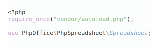
In general, it is recommended to use always a project to download your libraries. In an application normally there is more than one library needed.
- Some hosting areas are not accessible by a terminal or SSH. Then it is not possible to use Composer.
- To use Composer is sometimes complicated. Especially for beginners.
- Composer needs much resources. Sometimes they are not available on a simple webspace.
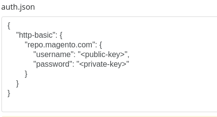
- If you are using private repositories you don't need to share your credentials. You can set up everything on our site and then you provide a simple download link to your team member.
- Simplify your Composer build process. Use our own command line tool to download the vendor folder as binary. This makes your build process faster and you don't need to expose your credentials for private repositories.
Informations about the package lombokcss
LombokCSS
Switch the look, not the HTML. A modern, token-first component CSS framework. Drop a class, get a working component — like Bootstrap. Re-theme everything by changing one attribute — like a design system. Ships at ~9.7 KB gzipped (full build, minified).
GitHub


npm


GitHub Packages


Quality







SourceForge


Community


Lombok Ecosystem





Documentation
| Overview | Getting Started |
| Migration from Bootstrap | Theming & Styles |
| Components | Forms |
| Utilities | Accessibility |
Why it's different
Most frameworks bake their look into each component, so changing the visual style means overriding hundreds of rules. LombokCSS inverts that:
- Components read only semantic tokens (
--lc-surface,--lc-text,--lc-radius,--lc-shadow,--lc-accent, …). - A "design style" is just a different set of token values. Switching it never touches component CSS or your HTML.
Dark mode (data-theme) and RTL (dir) are independent axes that compose
with any style.
Install
CDN (jsDelivr) — fastest start:
npm:
Pin a version for production (jsDelivr):
Download: grab dist/lombok.min.css (+ optional dist/lombok.js) and link them directly.
The JS is optional. Accordions, modals and <dialog> work natively without
it; the script only adds dropdown/tab/toast/table-sort/navbar-toggle/carousel/drawer/popover behavior.
Other registries:
| Registry | Install command |
|---|---|
| GitHub Packages (npm) | npm install @codinglombok/lombokcss |
| GitHub Packages (Container) | docker pull ghcr.io/codinglombok/lombokcss:0.1.8 |
| GitHub Packages (NuGet) | dotnet add package codinglombok.LombokCSS |
| GitHub Packages (RubyGems) | gem "lombokcss" → Lombokcss.assets_path for Sprockets |
| GitHub Packages (Maven) | <groupId>com.github.codinglombok</groupId> <artifactId>lombokcss</artifactId> |
Works with any bundler (Vite/Webpack/Parcel) and framework (Vue/React/Svelte) — just import the CSS. See the Getting started docs for per-tool snippets.
The five design styles
data-style |
Character |
|---|---|
modern-corporate-flat |
Clean, flat, neutral + one brand color, medium radius, soft shadows (default) |
resonant-stark |
Linear-style dark: high contrast, subtle borders, tight type, violet accent |
neo-brutalism |
Thick black borders, hard offset shadows, bold blocks, zero radius |
semantic-minimalist |
Minimal, neutral, generous spacing, serif display, readability-first |
glassmorphism |
Frosted glass over a gradient; translucent surfaces, glowing borders (with opaque fallback) |
Theming guide
Everything is a CSS variable. Override on :root (or a scope) to customize:
Dark mode — three ways, they all work together:
RTL — set the document direction; all components use logical properties:
Make your own style — add a token block, no component edits:
Component usage
Other components included: dropdown, drawer/offcanvas, popover, navbar
(+ mobile toggle), accordion (native <details>, no JS), breadcrumb,
pagination, avatar/avatar-group, progress, spinner, skeleton,
stat, list-group, steps, timeline, sidebar, sortable table,
CSS-only tooltip (data-tip="…"), kbd, code/pre, full form system
(inputs, validation, switches, input-groups).
Utilities
Layout (flex, grid, items-*, justify-*, gap-*, grid-cols-1..12),
spacing (p-*, m-*, logical), sizing (w-full, max-w-*, min-h-screen),
type (text-sm..3xl, font-*, text-start/center/end), color
(bg-surface, text-muted, border), radius/shadow, position/z-index, plus
responsive prefixes sm: md: lg: xl: (e.g. md:grid-cols-3).
Classless mode
Plain semantic HTML is styled with zero classes — headings, paragraphs, links,
lists, blockquote, table, form inputs, code/pre/kbd. Good for prose
and quick prototypes.
Architecture
Token layers
- Primitives & scale — spacing, font sizes, raw palette.
- Semantic tokens —
--lc-surface,--lc-text,--lc-border,--lc-accent,--lc-radius,--lc-shadow,--lc-blur, status colors. Components only ever reference these. - Style presets (
[data-style="…"]) re-map the semantic tokens. - Dark overlay (
[data-theme="dark"]/prefers-color-scheme) re-maps color tokens; composes with presets via[data-style][data-theme]pairs.
Browser support & accessibility
Modern CSS used with graceful fallbacks: :has(), :user-invalid,
accent-color, backdrop-filter (opaque fallback via @supports), logical
properties, native <dialog>/<details>. Components ship with visible
:focus-visible rings, ARIA hooks, and respect prefers-reduced-motion.
Testing
Visual-regression + behavior tests run via Playwright in CI:
Baselines are browser-specific. CI runs in a pinned Playwright container
(mcr.microsoft.com/playwright:v1.56.0-noble) so pixels match.
Publishing (maintainers)
Full step-by-step setup (repo creation, branch protection, secrets, Pages, release-please flow, npm/CDN, troubleshooting) is in GITHUB_SETUP.md.
Release flow uses release-please with Conventional Commits:
Documentation site
Full multi-page docs at docs/: Overview, Getting started, Migration from
Bootstrap, Theming, Components, Forms, Utilities, Accessibility. Open
docs/index.html locally or visit the live site at
https://codinglombok.github.io/LombokCSS/.
Need help? See SUPPORT.md.
License
MIT — see LICENSE.