Download the PHP package gianlucagiacometti/bootstrap-pickadate without Composer
On this page you can find all versions of the php package gianlucagiacometti/bootstrap-pickadate. It is possible to download/install these versions without Composer. Possible dependencies are resolved automatically.
Download gianlucagiacometti/bootstrap-pickadate
More information about gianlucagiacometti/bootstrap-pickadate
Files in gianlucagiacometti/bootstrap-pickadate
Package bootstrap-pickadate
Short Description Date picker extension for the Bootstrap date input element
License MIT
Homepage https://github.com/gianlucagiacometti/bootstrap-pickadate/
FAQ
Example:
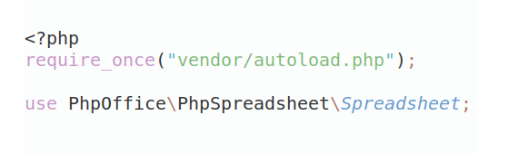
In general, it is recommended to use always a project to download your libraries. In an application normally there is more than one library needed.
- Some hosting areas are not accessible by a terminal or SSH. Then it is not possible to use Composer.
- To use Composer is sometimes complicated. Especially for beginners.
- Composer needs much resources. Sometimes they are not available on a simple webspace.
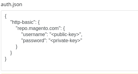
- If you are using private repositories you don't need to share your credentials. You can set up everything on our site and then you provide a simple download link to your team member.
- Simplify your Composer build process. Use our own command line tool to download the vendor folder as binary. This makes your build process faster and you don't need to expose your credentials for private repositories.
Informations about the package bootstrap-pickadate
bootstrap-pickadate
Bootstrap Pickadate is a small date picker for Bootstrap 5.3 and modern browsers.
It is intentionally focused on date selection. It does not provide time picking, recurrence, event scheduling, remote loading, or calendar-application features.
Requirements
- Bootstrap 5.3.x
- Bootstrap Icons ^1 for the default navigation icons
Files
Typical package files:
Load the CSS first, then Bootstrap, then Bootstrap Pickadate, then any locale files you need.
Basic usage
The visible field uses the active locale format. The hidden field receives an ISO date:
Two-input range usage
Use two separate visible inputs when the form needs independent start and end fields.
When the start date changes, the end picker receives that date as its runtime minimum. When the end date changes, the start picker receives that date as its runtime maximum.
Same-input interval usage
Use interval mode when one field should select a complete date interval, like booking/travel forms.
The combined hidden interval value is stored as:
Interval behaviour:
In interval mode the picker shows two side-by-side months. Duplicated overlap days between the first and second month are hidden to avoid visual confusion.
Data attributes
| Attribute | Description |
|---|---|
data-bs-pickadate-mode |
Picker mode. Use date for a single date or interval for same-input interval selection. Defaults to date. |
data-bs-pickadate-locale |
Locale code. Use current to follow bsPickadate.defaultLocale. |
data-bs-pickadate-default-locale |
Field-level fallback locale. |
data-bs-pickadate-format |
Visible value format override. |
data-bs-pickadate-hidden-target |
CSS selector for the hidden ISO date input, or combined interval input in interval mode. |
data-bs-pickadate-hidden-start-target |
CSS selector for the interval start ISO input. |
data-bs-pickadate-hidden-end-target |
CSS selector for the interval end ISO input. |
data-bs-pickadate-min |
Minimum selectable ISO date. |
data-bs-pickadate-max |
Maximum selectable ISO date. |
data-bs-pickadate-range-role |
start or end for two-input range mode. |
data-bs-pickadate-range-pair |
CSS selector for the paired range input. |
data-bs-pickadate-today-button |
true or false. |
data-bs-pickadate-clear-button |
true or false. |
data-bs-pickadate-close-button |
true or false. |
data-bs-pickadate-auto-close |
true or false. |
data-bs-pickadate-dropdown-width |
Optional CSS width for the dropdown. |
data-bs-pickadate-year-range |
Number of years shown around the current year when no min/max exists. |
JavaScript API
Compact localised interval formatting
Bootstrap Pickadate can format a date interval without creating a picker instance:
locale defaults to current, so the formatter follows bsPickadate.defaultLocale. dateStyle accepts full, long, medium, or short and defaults to long.
The formatter uses the browser's locale-aware date-range formatting when available. This lets each language use its own natural interval grammar instead of applying English-specific month/day suppression rules. If native range formatting is unavailable, Bootstrap Pickadate falls back to two localised dates separated by –.
The same formatter is also available from a picker instance and accepts ISO strings or JavaScript Date objects:
Locale handling
Locale files register themselves in:
The fallback chain is:
For example:
A website can set the active language after a navbar language change:
Month selector format
Locales can define a compact month label format for the month selector:
Supported tokens:
| Token | Meaning | Example |
|---|---|---|
m |
Month number without leading zero | 2 |
mm |
Month number with leading zero | 02 |
mmm |
Short month name | Feb, feb |
mmmm |
Full month name | February, febbraio |
Examples:
The full month name is still available to the component for labels and accessibility.
Global registry
Bootstrap Pickadate keeps active instances in:
This keeps the component consistent with the Bootstrap Select architecture used in related packages.
Optional jQuery integration
Bootstrap Pickadate is a plain JavaScript component and does not require jQuery.
If you want a jQuery-style application layer, gianlucagiacometti/web-toolbox provides jquery-bootstrap-pickadate. The wrapper keeps Bootstrap Pickadate as the underlying component and adds jQuery initialisation plus method-style calls.
Suggested script order:
Versioning
The intended version line follows Bootstrap compatibility:
Version 5.3.0 introduces the cached-DOM refactor and same-input interval mode.