Download the PHP package esoboy/ui without Composer
On this page you can find all versions of the php package esoboy/ui. It is possible to download/install these versions without Composer. Possible dependencies are resolved automatically.
FAQ
Example:
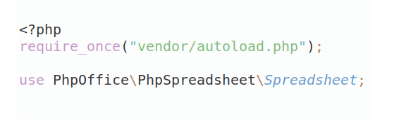
In general, it is recommended to use always a project to download your libraries. In an application normally there is more than one library needed.
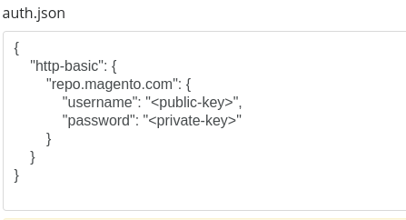
- Some hosting areas are not accessible by a terminal or SSH. Then it is not possible to use Composer.
- To use Composer is sometimes complicated. Especially for beginners.
- Composer needs much resources. Sometimes they are not available on a simple webspace.
- If you are using private repositories you don't need to share your credentials. You can set up everything on our site and then you provide a simple download link to your team member.
- Simplify your Composer build process. Use our own command line tool to download the vendor folder as binary. This makes your build process faster and you don't need to expose your credentials for private repositories.
Informations about the package ui
esoboy/ui
shadcn/ui for Laravel 13 and Livewire 4, with the same visual design and a PHP-first Blade interface. PHP renders content and values, Livewire handles server actions, and Alpine supplies the browser interactions that need it.
Requirements
- PHP 8.4+ (Rich Text parses HTML with its HTML5 parser) with the
intlextension (Statistic formats numbers for the app's locale), Laravel 13, Livewire 4 - Tailwind CSS 4
Installation
Import styles after Tailwind. Choose the groups your application uses; each includes its component dependencies, Nova theme and the Blade sources Tailwind needs:
| Entry | Includes |
|---|---|
controls.css |
Buttons, inputs, fields, checkbox/radio/switch, input groups, native select, toggles and icons |
overlays.css |
Controls plus dialogs, drawers, menus, popovers, tooltips and Command |
pickers.css |
Overlays plus Select, Combobox, Calendar, Date/Time Picker, Input OTP, Slider and Tabs |
display.css |
Controls plus cards, alerts, badges, avatars, tables, messages, toast and typography |
navigation.css |
Overlays plus sidebar, navigation, pagination, accordion, tabs, carousel and layout interactions |
data.css |
Pickers plus Data Table, table, pagination and badges |
trees.css |
Pickers plus Tree, Tree Select, Cascader and Transfer |
Imports share their dependencies; do not copy styles or register additional @source
paths for these groups. Application utilities still override defaults without !.
base.css contains the shared tokens, utilities and base states, with no component
template scan; group entries include it automatically.
For applications using the complete library, ui.css includes every shadcn component
and extras.css includes the remaining components (Editor, uploads, Tour, …):
Load the scripts and place the toaster and the confirm dialog once in the layout:
@uiScripts loads one deferred script with the components shadcn/ui has. The others,
and heavy browser engines (Editor, Signature, …), load their script the first time
they appear on a page, also when they arrive in a Livewire update; the app installs and
imports nothing else.
The package serves its scripts from /esoboy-ui/…. In production, publish them so the web
server serves them without booting Laravel:
Apps created from the Laravel skeleton already republish the laravel-assets group on
composer update, which includes these files. Published files are used only while they
match the installed version; otherwise the route serves them.
Usage
Common controls need only their data and a binding. Initialization, internal references and event handlers belong to the component:
Use value for an initial value, checked for a boolean control, open for a
disclosure, and active for navigation. A bound Livewire property takes precedence.
Use boolean multiple on Toggle Group and Combobox. Options may be a value-to-label
map, a list of strings, or records with value, label and optional disabled
and children.
Compound slots remain available when a selected label or layout needs custom markup. The breaking API changes, value shapes and server-side responsibilities are documented in UPGRADING.md. Old APIs have no compatibility layer.
Components are <x-ui::name>, their parts <x-ui::name.part>, named and shaped like
shadcn/ui's:
Controls inside <x-ui::field> show their validation errors; standalone controls don't.
Date Picker selects days by default. Use granularity="month" for YYYY-MM values.
Single selection binds a string or null. Multiple selection binds a list, and
range selection binds ['from' => …, 'to' => …]. Preset strings and disabled-dates
use the selected granularity. Presets also accept dates as DateTimeInterface
objects. In month mode, min and max accept month values or ISO dates and
include the month containing each boundary. caption-layout="dropdown" shows
a year selector in the month panel. Time selection applies to day granularity.
Dialog, Sheet, Drawer and Alert Dialog attach their trigger and close behavior to the single rendered control in each slot. Put the appearance and any application action on that control.
Popover, Dropdown Menu, Tooltip, Hover Card and Sidebar triggers use the same slot interface. Supply a focusable control with the appropriate accessible name.
A trigger comes before its content, as in shadcn/ui; the script pairs them, so overlays
need no ids and keep open through Livewire updates. Where shadcn/ui has open, bind it
with wire:model on the root (Dialog, Sheet, Drawer, Alert Dialog, Popover):
Icons are Lucide's, built in (the version is in resources/icons/lucide.php):
Icon sizes are xs (12px), sm (14px), default (16px), and lg (20px).
Without an explicit size, an icon is 16px on its own and follows its container's
icon sizing inside controls. An explicit size takes priority over that automatic
sizing. Use class for a custom size.
Use the canonical names shipped with the package. An unknown name fails the render.
A newer Lucide comes with a newer package (npm run icons regenerates the set).
From Livewire components, form objects and actions:
The Editor cleans the HTML it shows to its format. What it sends back is the app's to
clean before storing it, with the same format; Ui::plainText() gives its text.
Ui::editor() reaches an Editor of the calling component by its name, else the property
its wire:model binds, to insert what the app has itself (its media library):
Declare the media types the application can select for this editor:
The editor emits a bubbling ui-editor-media-request from its root. Each request
includes name (the editor's name or wire:model), requestId, source,
kind (image, video, audio or file) and operation.
Picker requests have source: 'picker', an insert or replace operation
and a multiple flag. To open the system picker, call the application's file input
from the Alpine listener during the same user interaction, then upload through the app.
A library picker can open through a Livewire action. Return the authorized attachments
through the Livewire component that owns the editor:
Each attachment has a web or relative url and may include name, mime, size
in bytes, alt, width, height, and poster. Supply the MIME type for image,
video and audio requests. file accepts any attachment, and replacing a file card
preserves its presentation. The result goes to the original editor and mapped position.
Each picker request can be completed once. A newer picker request, a disabled or
unmounted editor, a replaced document, entering source mode, or removing the
replacement target invalidates it.
Set :media-upload="true" to also receive one event per dropped or pasted file
(source: 'drop' or 'paste', operation: 'insert', with a file) and per
image to import (source: 'data' with a file, or 'external' with a url,
operation: 'import'). The editor offers each new image source once with
automatic: true. It uses false when the user asks to save an image. Same-origin images and
hosts listed in :image-hosts="['cdn.example.com', '*.assets.example.com']"
already count as belonging to the application.
For a file or image import, call request.respondWith(promise) synchronously in
the listener. The promise returns one attachment. Reject it with an Error to
show a failure message. Reject with an AbortError to cancel without a message.
An empty or invalid attachment also reports a failure.
For dropped or pasted files, the application can call request.progress(loaded, total)
with byte counts. To decline a request, leave it unclaimed. The application owns
authorization, validation, and transport. The editor handles progress, mapped
insertion positions and replacement of imported images.
Here uploadMedia is a method on the application's surrounding Alpine component.
The editor's toolbar collapses controls that do not fit into More by default. To show
all tools, wrapping onto new rows, turn off collapse-toolbar. For a custom toolbar,
use <x-ui::editor.toolbar :collapse="false">…</x-ui::editor.toolbar>; it also inherits
the editor's collapse-toolbar setting.
Use <x-ui::editor.tool> with an aria-label when a custom toolbar button
needs the editor's static tooltip. It forwards button attributes and the caller's
slot, including Livewire actions.
Long documents scroll inside the editor, keeping the toolbar and footer in place.
The content area's maximum height is 24rem; customize it with --editor-max-height
(use none to let it grow with the document). Fullscreen uses the available window height.
To keep toasts across wire:navigate, wrap the toaster in Livewire's @persist
in your shared application layout. Use the same key on each participating page.
This also keeps a toast shown before $this->redirect('/orders', navigate: true).
Typography
Heading renders a native h1 through h6 with level="1" through level="6".
Omitted or invalid levels render h2. Text renders an inline span.
Heading variants are title (default, foreground) and subtitle
(muted foreground). Text variants are primary (default,
foreground) and secondary (muted foreground). Variants only change color,
preserving the heading level, font size and font weight. Text variant="primary" uses the foreground color;
color="primary" uses the theme's primary accent color.
The Blade components map sizes to the original shadcn Typography examples.
Heading sizes are xs (H4), sm (H3), default (H2), and lg (H1).
The library also provides xl and 2xl for larger headings, using the theme's
text-5xl and text-6xl sizes.
Text sizes are sm (Small), default (body), and lg (Large).
Both accept
color="default|foreground|muted|primary|destructive|success|warning|info".
The default uses the variant's color. Explicit named colors override the variant's
color and follow the active theme.
Light and dark
Colors follow the system until a user picks a theme. Name the app on <html>; each app on
the site (admin, shop, …) keeps its own choice in one cookie, and the server renders the
page in it, so nothing flashes:
Any supported button or choice control picks the theme with theme: light, dark, system, or
toggle (between light and dark). Buttons act on click; Toggles, Switches, Toggle Group
items and menu radio items act on change, and every one of them shows the current choice.
Ui::theme('admin') gives the choice to render a control's initial state:
Tailwind's dark: follows the same choice.
Customizing
- Theme: every token lives in
@theme; a later@themeblock in the app overrides it. Light and dark values are paired withlight-dark(). - Styles: component defaults sit in
@layer components, so any utility class on a component wins without!. - Strings: override single lines in
lang/vendor/ui/{locale}/{component}.php, or publish them all withphp artisan vendor:publish --tag=ui-lang.
AI agents
The package ships Laravel Boost guidelines and an
esoboy-ui-development skill (every component with its parts, binding, forms, overlays,
Data Table, rich text, theming) in resources/boost. Boost finds them on its own:
php artisan boost:install lists esoboy/ui (guidelines, skills) among the third-party
packages, and once picked, boost:update keeps them current with the installed version.
Apps that already use Boost are offered the package the next time boost:update runs in
a terminal.
Development
Browser tests drive the demo app's pages in Chromium (Pest's browser plugin with
Playwright), one file per component in application/tests/Browser, plus a smoke test and
an axe pass over every page. Build dist/ first; the tests publish it:
dist/ is a build output and isn't committed on branches; a release builds it into its tag.
License
MIT. The Lucide icons are ISC, see resources/icons/LICENSE.
All versions of ui with dependencies

ext-intl Version *
bacon/bacon-qr-code Version ^3.1
illuminate/support Version ^13.0
illuminate/view Version ^13.0
livewire/blaze Version ^1.0
livewire/livewire Version ^4.4
symfony/html-sanitizer Version ^7.4|^8.0
tempest/highlight Version ^2.30