Download the PHP package clarifynl/responsive-pics without Composer

On this page you can find all versions of the php package clarifynl/responsive-pics. It is possible to download/install these versions without Composer. Possible dependencies are resolved automatically.

FAQ

After the download, you have to make one include require_once('vendor/autoload.php');. After that you have to import the classes with use statements.

Example:
If you use only one package a project is not needed. But if you use more then one package, without a project it is not possible to import the classes with use statements.

In general, it is recommended to use always a project to download your libraries. In an application normally there is more than one library needed.
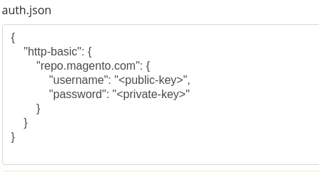
Some PHP packages are not free to download and because of that hosted in private repositories. In this case some credentials are needed to access such packages. Please use the auth.json textarea to insert credentials, if a package is coming from a private repository. You can look here for more information.

  • Some hosting areas are not accessible by a terminal or SSH. Then it is not possible to use Composer.
  • To use Composer is sometimes complicated. Especially for beginners.
  • Composer needs much resources. Sometimes they are not available on a simple webspace.
  • If you are using private repositories you don't need to share your credentials. You can set up everything on our site and then you provide a simple download link to your team member.
  • Simplify your Composer build process. Use our own command line tool to download the vendor folder as binary. This makes your build process faster and you don't need to expose your credentials for private repositories.
Please rate this library. Is it a good library?

Informations about the package responsive-pics

ResponsivePics

ResponsivePics is a WordPress plugin that enables WordPress theme authors to automatically resize images* in responsive layouts.

*ReponsivePics does not handle images in the WordPress wysiwig editor, it’s only useful for theme authors that use images or photos in their themes. It automatically handles retina or hdpi images via media queries.

Documentation

For full documentation and examples visit: responsive.pics

Table of contents

  1. Requirements
  2. Installation
  3. Configuration
  4. Usage
  5. Sizes
  6. Cropping
  7. Process
  8. Hooks
  9. Features

Requirements

Prerequisite How to check
PHP >= 5.6.x php -v
Wordpress >= 3.5.x wp core version
WP-Cron enabled or a real cron job set up test WP-Cron

Installation

You can install this plugin via the command-line or the WordPress admin panel.

via Command-line

If you're using Composer to manage WordPress, add ResponsivePics to your project's dependencies.

Then activate the plugin via wp-cli.

via WordPress Admin Panel

  1. Download the latest zip of this repo.
  2. In your WordPress admin panel, navigate to Plugins->Add New
  3. Click Upload Plugin
  4. Upload the zip file that you downloaded.
  5. Activate the plugin after installation.

Browser Support

Currently the <picture> element and srcset and sizes attributes on the <img> element are supported in all modern browsers except Internet Explorer 11.

In order to enable support for the picture element and associated features in browsers that do not yet support them, you can use a polyfill. We recommend using Picturefill.

To install Picturefill in your wordpress theme as a node module, run the following command from your theme directory:

npm

npm install --save picturefill

Yarn

yarn add picturefill

And import the package in your theme’s global javascript file: import 'picturefill';


Configuration

ResponsivePics uses the following default variables:

Variable Type Default Definition
$columns number 12 The amount of columns your grid layout uses
$gutter number 30 The gutter width in pixels (space between grid columns)
$breakpoints array ['xs' => 0, 'sm' => 576, 'md' => 768, 'lg' => 992, 'xl' => 1200, 'xxl' => 1400] The media query breakpoints ResponsivePics will use for creating and serving your image sources
$grid_widths array ['xs' => 576, 'sm' => 540, 'md' => 720, 'lg' => 960, 'xl' => 1140, 'xxl' => 1320] The maximum widths of your layout in pixels ResponsivePics will use for resizing your images
$max_width_factor number 2 The maximum factor of the width to use for resizing and cropping the height of an image source
$lazyload_class string lazyload The css class to be added on the img tag when lazyload is enabled
$lqip_width number 100 The image width to be used for the LQIP (low quality image placeholder)
$lqip_class string blur-up The css class to be added on the img tag when LQIP (low quality image placeholder) is enabled
$image_quality number 90 The image compression quality in percentage used in the WP_Image_Editor when resizing images
$wp_rest_cache boolean false Wether to enable cache in the WP Rest API response headers
$wp_rest_cache_duration number 3600 The cache duration (max-age) in seconds of the WP Rest API Cache-Control header

By default, ResponsivePics will use the Bootstrap 4 SCSS variables for defining:

The amount of grid columns: $grid-columns: 12;
The grid gutter width in pixels: $grid-gutter-width: 30px;
The grid breakpoints in pixels:

And the maximum widths of the containers in pixels:

Note: ResponsivePics will add the xs container max width for you (= 576), based upon the default sm grid breakpoint (= 576px).

If you have customized the bootstrap defaults or if you’re using a different grid system (Foundation, Materialize etc.), or even if you want to add extra breakpoints & container widths, you can pass your own grid variables to the ResponsivePics library.

Add these lines to your theme’s functions.php and make sure to check if the ResponsivePics class exists:

Helper Functions

You can retrieve any variables used in ResponsivePics by running one of these helper functions:


Usage

Image Element

For inserting a responsive <img> element in your template, use the get_image function or the responsive-pics/v1/image API endpoint with the available parameters.

PHP

REST API

Image Parameters

Parameter Type Required Default Definition
id number yes The WordPress image id (e.g. 1).
sizes string yes A comma-separated string of preferred image sizes (e.g. 'xs-12, sm-6, md-4, lg-3'). See the Sizes section for more information.
crop number/string optional false A crop-factor of the width for the desired height within the default range of 0-2 (e.g. 0.75) with (optional) crop positions (e.g. 0.75|c t). See the Cropping section for more information.
classes string optional null A comma-separated string of additional CSS classes you want to add to the img element (e.g. 'my_img_class' or 'my_img_class, my_second_img_class').
lazyload boolean/string optional false When true enables lazyload classes and data-srcset attributes. When native enables native loading="lazy" attribute. See the Lazyloading section for more information.
lqip boolean optional false When true enables LQIP classes and src attribute. See the LQIP section for more information.

Image Data

For retrieving the responsive <img> data in your theme, you can use the get_image_data function or the responsive-pics/v1/image-data API endpoint with the available parameters id, sizes, crop, classes, lazyload and lqip.

PHP

REST API

This will return an array containing the available image sources per breakpoint, alt text, mime type, boolean values for alpha channel and lazyload, an url for the lqip image and an array for the css classes.

Picture Element

For inserting a responsive <picture> element in your template, use the get_picture function or the responsive-pics/v1/picture API endpoint with the available parameters.

PHP

REST API

Picture Parameters

Parameter Type Required Default Definition
id number yes The WordPress image id (e.g. 1).
sizes string yes A comma-separated string of preferred image sizes (e.g. 'xs-12, sm-6, md-4, lg-3'). See the Sizes section for more information.
classes string optional null A comma-separated string of additional CSS classes you want to add to the picture element (e.g. 'my_picture_class' or 'my_picture_class, my_second_picture_class').
lazyload boolean/string optional false When true enables lazyload classes and data-srcset attributes. When native enables native loading="lazy" attribute. See the Lazyloading section for more information.
intrinsic boolean optional false When true enables intrinsic classes and data-aspectratio attributes. See the Intrinsic Aspectratio section for more information.

Picture Data

For retrieving the responsive <picture> data in your theme, you can use the get_picture_data function or the responsive-pics/v1/picture-data API endpoint with the available parameters id, sizes, classes, lazyload and intrinsic.

PHP

REST API

This will return an array containing the available picture sources per breakpoint, alt text, mime type, boolean values for alpha channel and intrinsic, an array for the picture css classes and an array for the img css classes.

Background Image

For inserting a responsive background image in your template, use the get_background function or the responsive-pics/v1/background API endpoint with the available parameters.

PHP

REST API

Background Parameters

Parameter Type Required Default Definition
id number yes The WordPress image id (e.g. 1).
sizes string yes A comma-separated string of preferred image sizes (e.g. 'xs-12, sm-6, md-4, lg-3'). See the Sizes section for more information.
classes string optional null A comma-separated string of additional CSS classes you want to add to the background element (e.g. 'my_bg_class' or 'my_bg_class, my_second_bg_class').

Background Data

For retrieving the responsive background image data in your theme, you can use the get_background_data function or the responsive-pics/v1/background-data API endpoint with the available parameters id, sizes and classes.

PHP

REST API

This will return an array containing the available background image sources per breakpoint, alt text, mime type, a boolean value if the image has an alpha channel, an id for the background and an array for the background css classes.

Supported image formats

The following image file formats are supported:

File format MIME Type Properties
jp(e)g image/jpeg
webp image/webp Requires Wordpress version 5.8 or higher.
png image/png When the png contains an alpha channel, an extra 'has-alpha' class will be added to the picture image element for additional styling.
gif image/gif When the gif is animated (it will check for multiple header frames), no image resizing or cropping will be done to prevent discarding the animation.

Any other image formats, will not be resizes or cropped.


Sizes

Image sizes

The following syntax is available for each image size in the sizes parameter:

Parameter Type Required Default Definition
breakpoint number or string yes If undefined, and width is a number, breakpoint will be the same as the width. If undefined, and width is a column definition, breakpoint will be the corresponding breakpoint (e.g. if width is 'xs-8', breakpoint will be 'xs').
width number or string yes A column definition is a key in $grid_widths plus a dash and a column span number (e.g. 'xs-8').
If the column span number is suffixed with -full (e.g. 'xs-8-full'), the column width is calculated as a percentage of the $grid_width, but as the next matching $breakpoint width (like in a .container-fluid).
You can also use full as span number (e.g. 'xs-full') for full width size based upon next matching $breakpoint width.

Picture & background sizes

Since the <picture> element and background images support art directed images, the following full syntax is available for each image size in the sizes parameter:

The following parameters are available in the sizes syntax:

Parameter Type Required Default Definition
breakpoint number or string yes If undefined, and width is a number, breakpoint will be the same as the width. If undefined, and width is a column definition, breakpoint will be the corresponding breakpoint (e.g. if width is 'xs-8', breakpoint will be 'xs').
width number or string yes The desired (max) width of the image (e.g. 800). A column definition is a key in $grid_widths plus a dash and a column span number (e.g. 'xs-8').
If the column span number is suffixed with -full (e.g. 'xs-8-full'), the column width is calculated as a percentage of the $grid_width, but as the next matching $breakpoint width (like in a .container-fluid).
You can also use full as span number (e.g. 'xs-full') for full width size based upon next matching $breakpoint width.
height number optional The desired (max) height of the image (e.g. 500).
factor number optional A crop-factor of the width for the desired height within the default range of 0-2 (e.g. 0.75).
crop_x number or string optional c Crop position in horizontal direction (e.g. c). See the Cropping section for more information.
crop_y number or string optional c Crop position in vertical direction (e.g. b). See the Cropping section for more information.

Cropping

The following options are available as valid crop positions:

Crop position shorthands

You can use the following crop position shorthands in horizontal direction (x):

And in vertical direction (y):

If the vertical direction is not set, the horizontal direction x will be treated as a shortcut:

Crop position percentages

You can also use percentages as valid crop position syntax:

In this case both the coordinates x and y need to be passed.

Focal Point

When you want to crop an image but keep a certain area of the image in view, you can use the f(ocal) shorthand feature. In order to set this focal area of an image, we added a focal point picker interface to several views of the Wordpress media framework.

Attachment Details

When clicking on a thumbnail from the Wordpress Media Library grid view, you will see the Attachment details modal. This will be the most accurate view to select your focal point:

Featured Image

When setting or replacing an featured image in a page or post, you will see the Featured image modal. In this view you can select your focal point in the thumbnail at the top of the right sidebar:

Edit Image

When uploading or editing an image in the WYSIWYG editor or meta field in a page or post, you will see the Edit image modal. In this view you can select your focal point in the thumbnail at the top left:

There are 3 ways you can set the focal point of an image with the interface:

By using one of these options a post meta key named responsive_pics_focal_point will be added or updated to the attachment with an array value containing the x & y coordinates as percentages:

To use this value elsewhere in your theme, you can retrieve it by calling:


Process

  1. When visiting a front-end page and a ResponsivePics function call is made, this library will add the resize and/or crop image task as a job to the background process queue using Action Scheduler.
  2. On every page load or on the next cron interval, Action Scheduler will run the next batch of jobs in the background process queue. See the Cron section for more information.
  3. When a job is up next in the queue and ready to be processed it will execute the resize and/or crop task and save the image in the same location as the original image when successful and it will remove the job from the queue.
  4. Once the image variation is created, it will skip the process of that variation on the next page load.
  5. When you change one of the image size parameters, it will automatically try and create the new image variation on the next page load.
  6. When the original image does not meet the dimension requirements of the requested image size, it will skip that image size variation and proceed to the next image size.
  7. Alt text will automatically be added on the picture img element if the original image in the media library has one.
  8. When deleting an attachment from the library, it will also delete all the resized images created by this plugin.

Background Processing

The background processing library Action Scheduler has a built in administration screen for monitoring, debugging and manually triggering scheduled image resize jobs. The administration interface is accesible via:

Every resize job will be grouped by it's wordpress image id

Cron

When you are using the built-in WP-Cron, the background process queue will only process any tasks on every page load.
If you have disabled WP-Cron in your setup and you are using your own cron job on your server, Action Scheduler will use the interval set in that cron job to process the next batch of jobs.

If you're using Trellis like us ❤️, the default cron interval is set to every 15 mins.
You can override this to for example 1 mins with setting the cron_interval (or cron_interval_multisite for multisite) variable per wordpress site to */1:

In for example trellis/group_vars/development/wordpress_sites.yml:

Don't forget to re-provision your server after changing this value.

Error handling

If an error occurs during the resizing process or if there's invalid syntax, ResponsivePics will display or return an error.

PHP

ResponsivePics errors
- breakpoint xxs is neither defined nor a number

REST API


Hooks

The following actions allow you to hook into the image resizing process timeline. You can place them in your theme's functions.php file.

responsive_pics_request_scheduled

This action fires when ResponsivePics has scheduled a new image resize request to the ActionScheduler queue.

Parameters


responsive_pics_request_processed

This action fires when the ActionScheduler has processed an image resize request in the queue.

Parameters


responsive_pics_file_saved_local

This action fires when ResponsivePics has successfully saved a resized image file locally.

Parameters


responsive_pics_file_s3_uploaded

This action fires when WP Offload Media has uploaded the resized image file to your S3 storage.

Parameters


responsive_pics_file_deleted_local

This action fires when ResponsivePics has successfully deleted a resized image file locally.

Parameters


responsive_pics_file_s3_deleted

This action fires when WP Offload Media has deleted a resized image file in your S3 storage.

Parameters


Features

S3 Offload

When you installed and activated the WP Offload Media (Lite) plugin, this library automatically:

NOTE

When the Remove Files From Server option is activated in the Offload Media Lite settings, this plugin will NOT remove any resized/cropped image generated by this plugin!

Lazyloading

When enabling the lazyload option in the get_picture or get_image functions or API endpoints with a boolean value true, this library automatically:

This will enable you to use a lazy loading plugin such as Lazysizes.

You can also set your own lazyload class by passing it to ResponsivePics library in your theme’s functions.php:

To install Lazysizes in your wordpress theme as a node module, run the following command from your theme directory:

npm

npm install --save lazysizes

Yarn

yarn add lazysizes

And import the package in your theme’s global javascript file:

When enabling lazyload with a string value native, this library automatically:

LQIP (Low Quality Image Placeholder)

When enabling the lqip option in the get_image function or /responsive-pics/v1/image API endpoint, this library automatically:

This will enable you to style your placeholder image before the actual high quality image is loaded.

You can also set your own lqip class by passing it to ResponsivePics library in your theme’s functions.php:

Intrinsic Aspectratio

When enabling the intrinsic option in the get_picture function or /responsive-pics/v1/picture API endpoint, this library automatically:

This will enable you to pre-occupy the space needed for an image by calculating the height from the image width or the width from the height with an intrinsic plugin such as the lazysizes aspectratio extension.

To use the Lazysizes aspectratio extension in your wordpress theme, first install lazysizes as a node module as described in the Lazyloading section and import the extension in your theme’s global javascript file:


Issues

Please submit any issues you experience with the ResponsivePics library over at Github.

Todo's

Maintainers

ResponsivePics is developed and maintained by:

@monokai (creator)
@twansparant (creator)

Copyright

Code and documentation copyright 2017-2023 by Clarify.
Code released under the MIT License.
Docs released under Creative Commons.


All versions of responsive-pics with dependencies

PHP Build Version
Package Version
Requires php Version >=5.5.0
composer/installers Version ^1.0|^2.0
Composer command for our command line client (download client) This client runs in each environment. You don't need a specific PHP version etc. The first 20 API calls are free. Standard composer command

The package clarifynl/responsive-pics contains the following files

Loading the files please wait ....